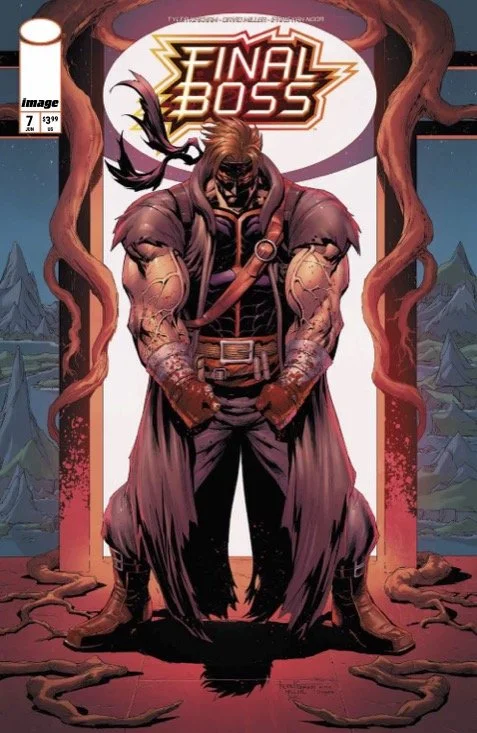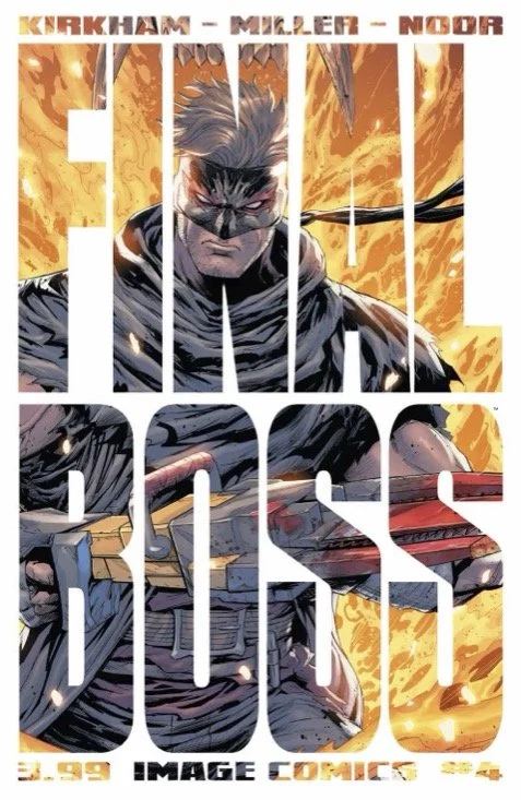
Final Boss #4 // Review
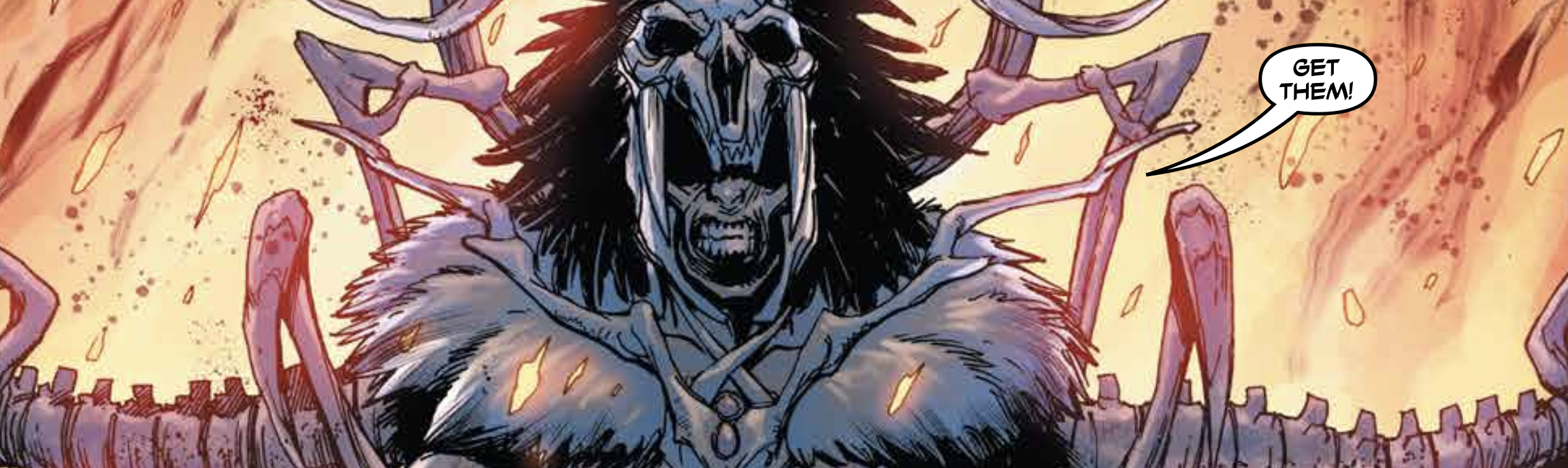
Tommy and Rabak are waking-up in a hotel on the island. Tommy’s gotten some sort of a mysterious letter. Help someone rescue “the forgotten” and he’ll be provided with the answers he’s looking for. Those answers have to do with his father. They won’t come easily in Final Boss #4. Writer/Artist Tyler Kirkham, artist David Miller and colorist Ifansyah Noor continue a cheesy, pulpy action series. The art may be a throwback to the Image Comics style of the early 1990s, but the story itself is a relic of an earlier age of action where rugged, loveably dumb, mesomorphic white heroes stood against an armies of tribal savages.
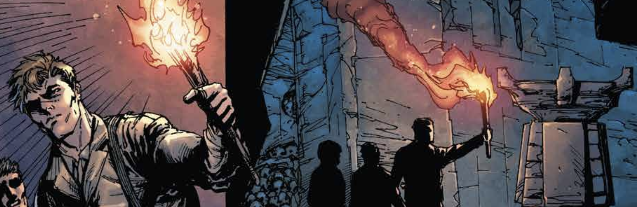
The two men are being prompted to train for the competition, which brings them to the island. But this mysterious note seems to take precedence over the official reason for them being there. Tommy really wants to know more about his father. Clearly there's somebody there who knows that he's looking for that information. The search for that information is going to find him right in the middle of a group of slaves who are being worked to death by a group of island natives. Tommy and Rabak are going to be thurst into some pretty serious danger in the process of trying to free the slaves.
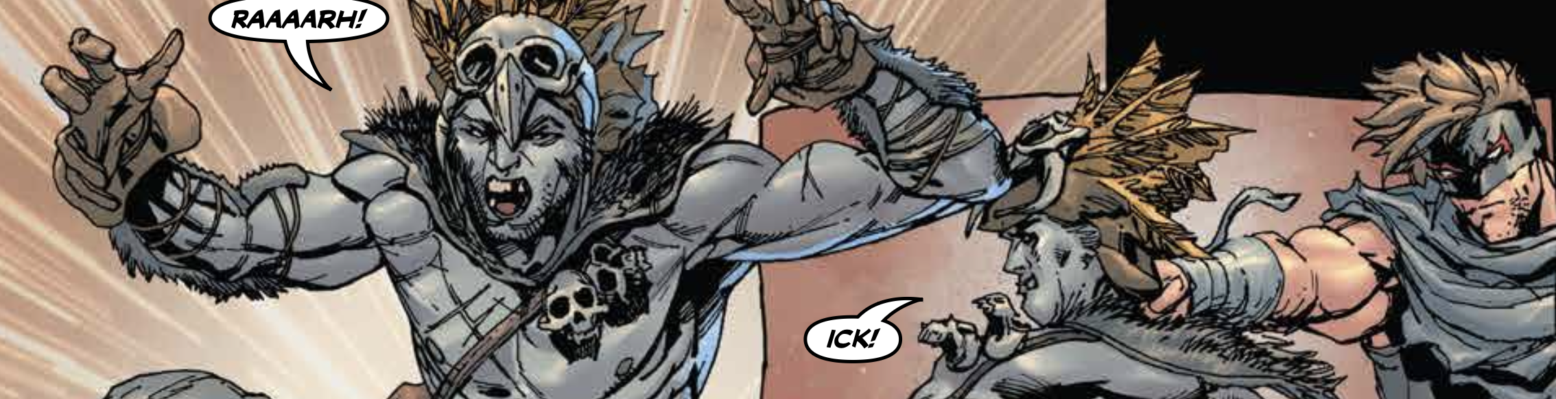
Edgar Rice Burroughs meets Rob Liefled meet on the comics page under the influence of a 1990s 1-on-1 fighting game. It's profoundly silly stuff. The idea of savages in islands in the South Pacific, who are vicious cannibals just seems so completely outdated that it couldn't possibly be anything other than absurd. It's not like it isn't fun on a very superficial level. So many of the basic elements of the plot feel like they would be more in place in an earlier era. It's kind of difficult to take this story seriously in more contemporary era of much more sophisticated action fiction. Kirkham’s writing isn’t inconsistently bad...it’s just not terribly progressive. By virtue of that, it comes across as being a shadow of a reflection of past eras.
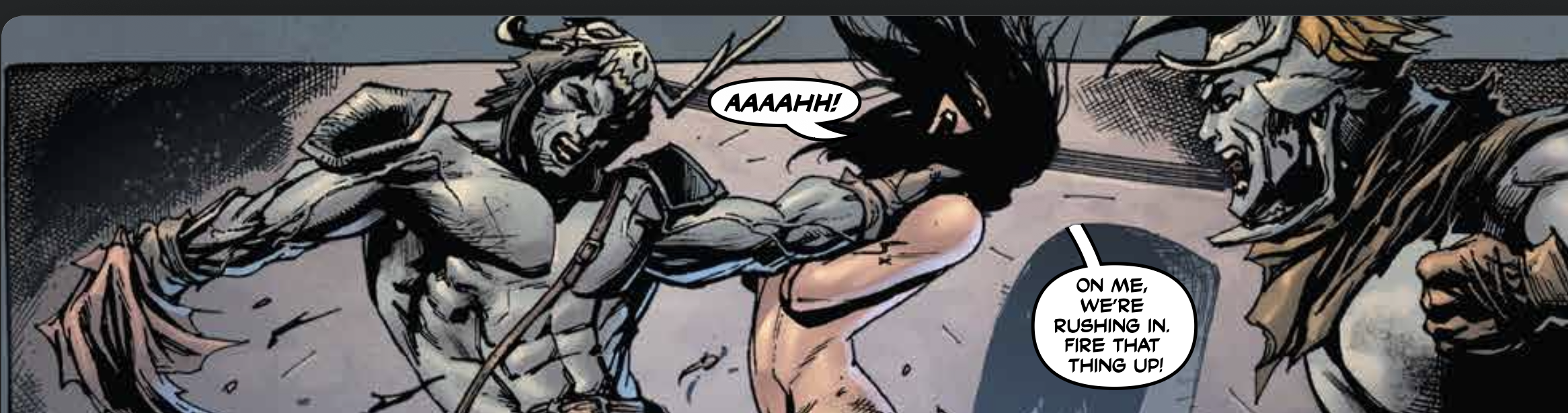
Kirkham’s art must come across his comfort food to those who remember the when it was in style. The visual reality of the series is defined by the highly-rendered detail of action artwork. It values, gross exaggeration in a form and movement over plausible, kinetics, and realistic anatomy. As a result that comes across as being every bit is awkward as so much of the art that had haunted comic book pages in the early 1990s. The color doesn't land a little bit of death to the visuals.
As this is a single episode in a longer running action series, it's not necessarily characteristics of the way the rest of the series is going to be going. Kirham and your company are paying homage to an action hero aesthetic from an earlier era and there's a lot to go over that had been brought to page and screen over the course of the mid late 20th century. They've got a lot of grant to cover if they're really going to pay homage to everything through the specific aesthetic that they're bringing to the page for Final Boss.