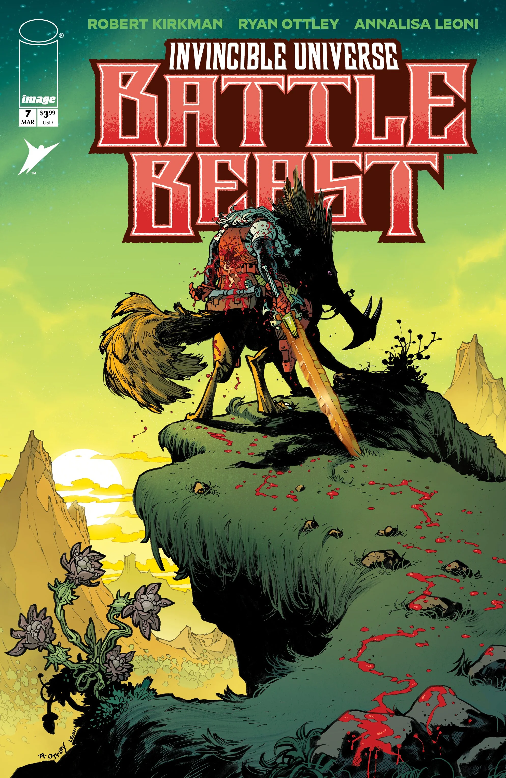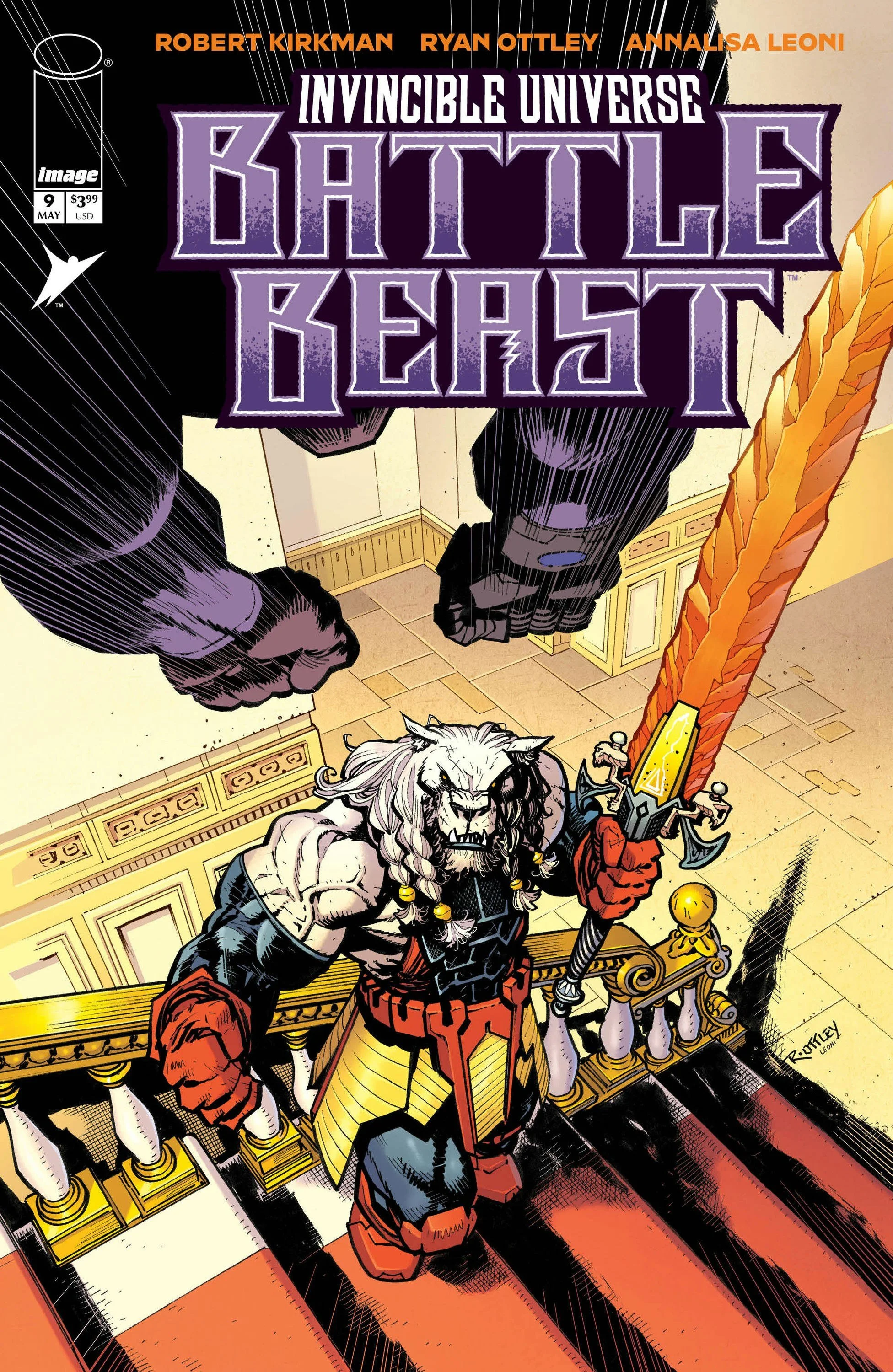
Battle Beast #9 // Review
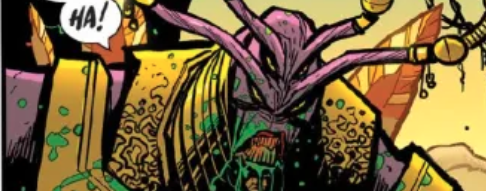
The beast stands horribly be-weaponed. There’s blood all over his hands. He’s addressing the one who stands before him. He tells the opposing individual that if he truly IS powerful enough to give him the death he desires, then he should step forward. He does so while mocking his idea of a worthy death. And then he launches into a monologue of his own in Battle Beast #9. Writer Robert Kirkman takes a reasonably good set of ideas and pummels the joy and novelty out of them with artist Ryan Ottley and colorist Annalisa Leoni. There's real power on some of what Kirkman is bringing to the page.
After a long winded pair of dueling monologues, the whole thing is over before it even starts. The title character sighs in disappointment. And the story continues. The battle beast is restless. However, he's willing to stick around for just a little while longer. He's waiting for the challenge that will result in his death. It may take some time. The king that the beast is working with has his own problems. One of the problems is keeping the beast happy. It's going to be uphill work. Surely there must be something to maintain the security of the beast's presence.
Somewhere at the heart of the story, there really is some very clever idea that might be sharply allegorical. The idea of a king rising to power due to a sentient weapon that really belongs for its own destruction is very poetic in its own way. Certainly does have interesting connections with the idea of the military industrial complex in the contemporary geopolitical world. To be able to do something like that with epic space fantasy would be really cool. But Kirkman isn't really moving in that direction. And that would be fine. If what he was doing was terribly compelling. And it's really not in and of itself.
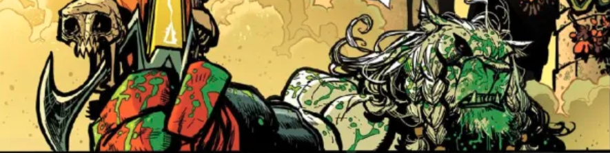
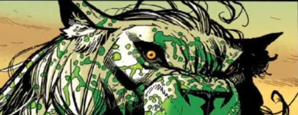
The artwork, on the other hand, is gorgeous. The space fantasy that's being brought to the page has its own distinct fingerprint on the page. The rendering style carries some beautiful detail to it that feels like it’s tilted just right. And there's a real beauty to the alien nature of the color that Leoni braces the page with. It's not just texture and shadow. There's a lot more going on here than just that. The distinct colors of an alien world feel unique. And yet they're perfectly ordinary colors that could be found in any swatch. It's something about the pallet that she's using that is just really sharp. Really interesting. And really distinct.
Kirkman’s premise is not without merit. It really could be something if he could just edit it in just the right way, it really might turn into something entertaining. As it is, though, there are so many bits of exaggeration and amplification around the edges of everything that don't really serve the center of supremacists to true potential. It's possible that Kirkman is working with is a couple of good ideas that would work better on their own. Or maybe he could just spend a little bit less time dealing with one of them.