

Hey Kids! Comics!--The Schlock of the New #1 // Review
A couple of guys who aren’t Siegel and Shuster pitch an idea that isn’t Superman to an editor who isn’t at DC. (But it really is Siegel and Shuster, and it really is Superman.) Elsewhere, there are a few artists being introduced to a guy who isn’t Bob Kane about this new character he’s working on who isn’t Batman. (But it really is Bob Kane, and it really is Batman.) Writer/artist/comic book industry veteran Howard Chaykin continues his historical drama (with names that have been changed to protect the guilty). The series advances into its third incarnation with Hey Kids! Comics!--The Schlock of the New #1. The sparklingly well-written series continues in a promising opening for a remarkably clever third series.
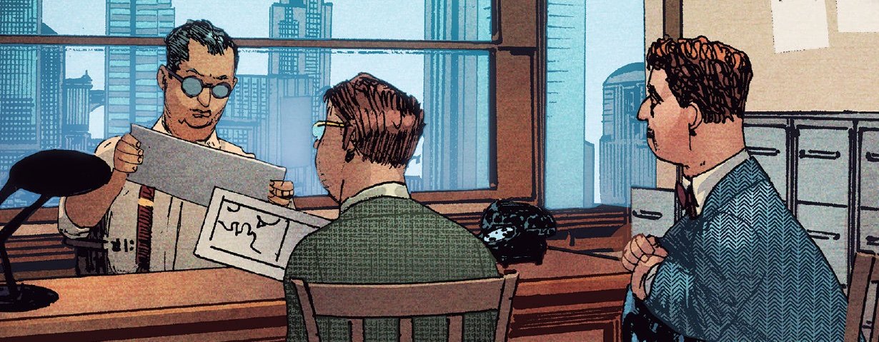
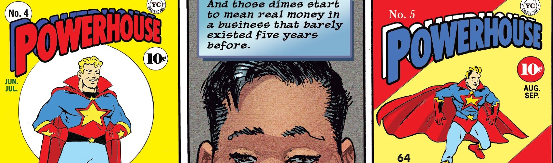
Ted Whitman, Benita Heindel, and Itzhak Geib are all friends. They’re all people who are more or less invisible in the pop cultural ghetto of science fiction, but they all have an opportunity to work in comics as they grow up. It’s not going to be pretty, though. The industry is a pretty ugly place in the early part of the Golden Age, and they are all almost certainly going to be taken advantage of in some way. Meanwhile, the brightly-clad “Powerhouse” becomes a mega-hit that catapults the industry forward, and the dark heroism of “Midknight” might become just as big.
Chaykin clearly isn’t writing for a general audience with the series. Earlier entries in the series will attest to that. One would have to have more than a passing knowledge in the early history of the comics industry to follow what is going on in Chaykin’s narrative as it moves around in history in a decidedly non-linear fashion. The specific weight of what’s going on is given some impact. The casual reader COULD understand the plight of the artists and what they’re dealing with as Chaykin’s third series gets off the ground, but the full weight of it would be difficult to follow for those unfamiliar with the era.

There’s a clever maturity in the way Chaykin is delivering the look and feel of the early 1940s. There’s a scene that opens the issue set in 1970 as well. There’s a distinct variation in visual style between the two eras. Chaykin’s layout is occasionally brilliant, with three different characters continuing their backstory on three different layers throughout much of the middle of the issue. The explosion of the comics industry is laid out on one of the pages in a way that looks much like a comics rack. Subtleties in stress and tension hit the page in clever ways. They absolutely have to, though: Chaykin needs to nail the dramatic impact of one scene before advancing to the next in a flurry of storytelling that isn’t exactly linear.

As an artist, Chaykin is one of those few talents who has given himself a chance to truly grow artistically over the decades. Kirby’s work in the 1940s didn’t look all that different from his work in the 1980s. Ditto for Ditko. There’s a clean line between McFarlane’s Batman and his Spawn. Liefeld...has always been Liefeld. The list goes on. Chaykin’s style shows a bold progression line, with this series up from anything else that he’s done, and it’s clear that he’s improving and growing...and continuing to do some really remarkable work.


