

Batman: Kings of Fear #1 // Review
Batman has a long and storied career at DC Comics. He has been seen in many different incarnations, by many different creative teams., though not all stories have resonated with readers. A good number of those stories came from the early 90s. Tv shows, bands and fashion are among the many things from the 90s are making a comeback these days. Comic art and storytelling from that era should stay there. This miniseries sees the return of artist Kelley Jones on pencils and inks, while former Batman editor Scott Peterson steps into the role of writer, with colors handled by Michelle Madsen.
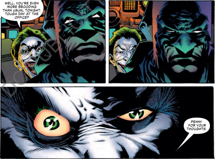
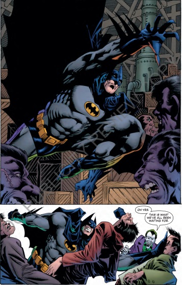
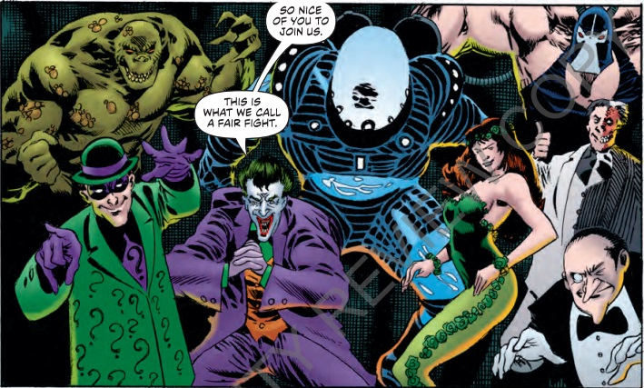
After foiling another of Joker’s mad schemes, Batman returns the Clown Prince of Crime to Arkham Asylum, but his visit is interrupted by an alarm sounding a prison break. Batman is immediately thrust into the heat of battle, as he needs to engage with seven of his most notorious enemies.
Scott Peterson has some good ideas on how this story should unfold, but they get lost in a shuffle of mundane conversation and the return of the goofy sound effects that appear during a scuffle like the Adam West days. A conversation with Batman and The Joker should be insightful into their bizarre relationship, but Peterson doesn’t seem to have a firm grasp on either character. The Joker comes off as an annoying little brother and not a criminal mastermind, while Peterson’s interpretation of Batman come off as jaded and cold. The Joker doesn’t seem to bother him anymore, because in the midst of his rambling, Batman simply tells the Joker to shut up. While this is good for a quick laugh, it just seems very unlike Batman. Peterson plants the seeds for what could turn out to be an interesting story idea. The interaction between the Batman and an unnamed nurse is quite volatile. She blames Batman for the behavior of the criminals, believing that he is the reason for their dangerously obsessive personalities. Batman, not losing any stride, throws it right back at her. Peterson should really examine more of this dynamic, as it could lead to some interesting character interactions that have yet to be explored in a Batman book.

The Dark Knight has seen many different design interpretations over the years. Some have really struck a chord with readers, others not so much. Artist Kelley Jones, best remembered for his pencil work on Batman: Red Rain Trilogy, Haunted Gotham and Gotham after Midnight, returns to a solo Batman title after some time. Jones has a very unique vision of Batman that worked well for the dark and gothic style of those books. Kings of Fear, however, does not fit that style at all. Jones’ signature Batman has absurdly long ears on the cowl, so you can tell right away when he is doing the art on a Batman book, but, without a distinct atmosphere like the older books had, this Batman design feels very dated and out of place. Proportionally, many of the characters do not look like they were done by a professional. Legs and knees extending further than they should, while one ear of the already long cowl ears is shorter than the other in one particular panel. The character artwork looks like it’s from the mid-90s, one of DC’s weaker periods. The design of the gallery of rogues featured in the prison break is a particular letdown, as they are some of the most famous. Mr. Freeze’s helmet is so frosted over, his facial features are barely recognizable, and resembles a frozen egg. The Penguin has disproportionate nose and chin that looks like a mix between Jay Leno and FDR. The villains aren’t the only that suffer design flaws. Batman has that extreme muscle appearance from the time that should never see the light of day again. There is some light at the end of the tunnel, however, as some of the panels with facial closeups reveal some very detailed work on both Joker and Batman. The pencil work and inking really highlight Batman’s concerned visage, and showcases the Joker’s twisted features as well. Jones’ design of The Scarecrow and the effects of his fear toxin will most likely be the high point of this miniseries, as the Scarecrow fits perfectly with the gothic style Jones is known for. Michelle Madsen’s colors don’t really enhance this issue that much, but they don’t hinder it as much as the writing and art. The color red seems very prominent in this issue. Madsen chooses to use it selectively, and it works very well. A splatter of blood, the Joker’s lips and Scarecrow’s eyes are some great examples.
This was a very surprising first issue for a miniseries that was hyped up with the return of Kelley Jones. 2018 is seeing a Batman title that looks and reads like it was straight out of the 90s. While there are a few shining moments throughout this first issue, overall, it was a big let down. It will be interesting to see if the creative team can recover from this weak first outing and deliver something memorable. Most trips down ‘Nostalgia Lane’ are pleasant; this one, however, wasn’t.


