Deadpool: Badder Blood #2 // Review
Wade’s ex-bestie is named Thumper. (Really.) And as it turns out, Thumper is looking to try to become some kind of kingpin of crime. If that wasn’t enough, Alpha Flight and Wolverine are after Thumper, who just happens to be a product of the same Canadian government super-soldier program as...everyone else who is out looking for him. It’s one big pursuit in Deadpool: Badder Blood #2. Writer Chad Bowers scripts a story co-written and drawn by Rob Liefeld with colorist Jay David Ramos. It’s a kind of a mess of a story, but Liefeld’s artwork certainly is...Liefeldy.
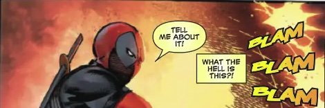
Before Wade can get down to the business of finding his friend, he’s got a problem with Shatterstorm. She’s staring him down in combat. She’s been trained with some of the deadliest techniques known to an alien world that shoots action films without any respect for the safety of the actors. She’s brutal. Wade’s capable of being even more deadly, though. And the fact that he won’t stop talking actually kind of works to his advantage in its own weird kind of way. He’ll defeat her, but he IS running out of time to find Thumper.

Liefeld has set up a pretty simple story. Even in and within the confines of the plot that he’s delivering, there’s great potential for something far more sophisticated that he simply isn’t going for. The important thing is that he’s delivering a sequence of easily-rendered fight scenes to the page. He does that pretty well. If he was to try anything more sophisticated than that, it might all fall apart. Bowers handles the scripting with a degree of flair, though the dialogue IS pretty weak for much of the run of the issue. There are some interesting ideas expressed in dialogue, but they all sound so very, very flat.

Ramos does an excellent job of delivering depth to the action with the colors. There’s a tension to the mood that feels almost immersive even without any background at all of any kind. Some of the power and aggression of the action can really be felt in muscle and blood, as delivered to the page by Ramos. It’s too bad the artwork he’s working with is so awful. After several decades in the industry, Liefeld STILL hasn’t got a solid grasp of basic anatomy, panel composition, page layout, or the simple kinetics of action across the page. But, y’know...the color is cool.

Once again, it’s apparent that the series isn’t really offering anything that hasn’t been done countless times before with various X-books over the years. This wouldn’t be all that bad if it was executed with any competence of execution. Deadpool is a very cool character. He deserves better than Liefeld. And...he IS getting better than this...with Alyssa Wong’s series. The first couple of issues of Liefeld’s series just aren’t any good. But, y’know...the color is actually really cool.