

Chrono-Cat: There and Back Again #1 // Review
There’s a princess who has been taken captive on a ship in the far reaches of the galaxy. It’s Lord Argo’s prison ship. Very tricky to escape from a place like that. Of course...princesses being held captive in remote regions will end up being the concern of certain heroes. This time heroism comes in a small, furry form in Chrono-Cat: There and Back Again #1. Writer Stu Perrins opens a weird space fantasy adventure with artist Joe Covas and colorist Ron Gravelle. The whole feel of the things is bizarrely anachronistic.

The heroic cat wakes-up in and amidst a bunch of trash. It’s been a pretty rough go of it recently. He recently stopped his own creation and...in the process caused a certain villain to come into being who has been making a muck of things. On top of that, he is being approached by a little imp in a top hat named Jedidiah. He’s appeared there before Chrono-Cat fresh from Elsewhere--a magical realm situated on the edge of dreams. He’s been granted a gift by the great wizard Stickletwig: he’s been given the opportuniy to deliver the power of one magic wish to a single person...and who better to give that wish to thena Chrono-Kat?

Covas has a whimsical storytelling style. Some of the basic elements in the story seem interesting enoguh, but they’re not put together in a way that feels particularly interesting. The overall execution lacks a coherent grounding. Chrono-Cat isn’t given a strong enough background from which to deliver all of the weird that Covas is bringing to the script. So it feels like it’s not quite where it needs to be in order to feel like anything other than a half-formed dream.
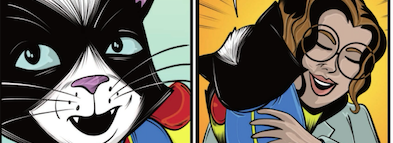
Once again, the title character comes across looking a bit like Rocket Raccoon as he makes his way through an adventure that feels suitably cartoonish. The visuals are strange, goofy fun. It’s a visual reality that doesn’t try to take itself too seriously, but it lacks any significant emotional resonance. There needs to be a better execution of the basic emotionality of the story in order for it to feel like it’s anything more than...strnage. It would need to have more depth in order for it to do what it needs to do to have more visual appeal.

The style and quality of the indie comic feels like something out of the indie comics boom of the late 1980s/early 1990s. Though the production quality of the visuals feels pretty well-rendered with decent color and crisp, vivid images...it still manages to feel like a first draft for something far more witty and sophisticated that could have easily come about in some other format on some other level. There’s a great deal of potential in the series and quite a bit of wit in the script, but it feels like it hasn’t really been allowed to come together into anything particularly coherent in the first issue.


