

Man-Eaters: The Cursed #3 // Review
Craft Camp has been around for a great many years. Writer Chelsea Cain takes a look back at an earlier era in the wholesome summer camp for young practitioners of magic in Man Eaters: The Cursed #3. Like previous issues in the series, Cain and graphic artist Lia Mitternique take an excursion away from the comic book format to develop the world a bit more in the form of a publication from the world of the story. In this case, it’s a 1983 issue of Witchcraft For Children. With wit and heart, Cain and Mitternique present a look into Man-Eaters that no single chapter of a comic book would reasonably be able to manage on its own.

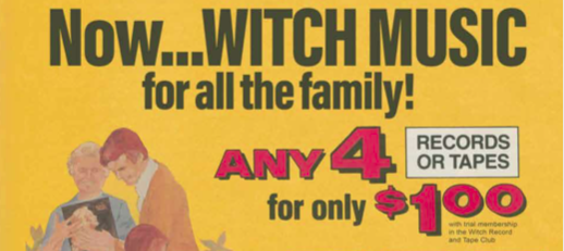
The world has always been a complicated place. Witches have had a challenging time of it. A 1983 issue of Witchcraft For Children casts a glance into the complex psychology of witches and the problems they face in an era before mobile phones and the internet. Articles include a valuable guide to spells that harness loss and possible rituals to honor those who have gone missing or possibly died. The issue is filled with early-’80s-era ads for everything from pet sand fleas to information about witch colleges, an offer from a Columbia House-style witch record club, and more.

Cain does a brilliant job of opening the world of Man-Eaters just a bit more with another surprisingly dense non-comic-book issue. The world of the series expands considerably in a chapter that addresses some of the darkness that witches suffer in sophistication, subtlety, and nuance. The feature on spells that can be cast using the tears of the spell-caster is profoundly engaging on an emotional level. The intricacy of what Cain is delivering in that piece alone is kind of overwhelming. The feature on “Remembering the Lost Girls of Craft Camp” has a profound amount of depth as well.
There’s a hell of a lot of thought that’s been put into the specific way that the layout interfaces with the culture of witchcraft. At first glance, Mitternique’s design style seems firmly rooted in a late 1970’s/early 1980’s aesthetic that doesn’t quite fit the distinct cultural fingerprint of 1983. But this IS kind of a parochial Wiccan publication put together for a religious group. So it’s going to feel a bit stiff and dated by the more contemporary standards of mainstream publications of the era. Mitternique nails a very distinct feel for the culture of the era. The visuals alone conjure up the distinct smell of an old, slightly yellowing magazine from the early 1980s.

Once again, Cain and Mitternique develop a new, non-traditional narrative piece for an issue of Man-Eaters that wouldn’t feel quite at home in any other format. It’s silly and strange in places, but the third issue of the new series is breathtaking in the range and scope of moods and emotions that it’s able to conjure.


