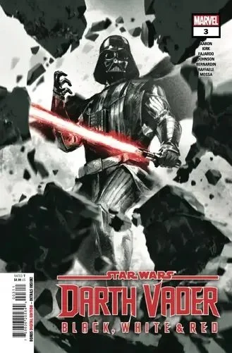
Star Wars: Darth Vader – Black, White & Red #3 // Review
Delta Team had a plan. (They did.) Come at their target from all sides at once, and he would be as helpless as a baby Jawa. Seriously. It should have worked. And in a sense...maybe it did. Of course...their target only happened to be the most totally evil person in the whole galaxy. So everything’s going to be a bit more complicated than usual in Star Wars: Darth Vader – Black, White & Red #3. Writer Jason Aaron continues his multi-part story with the aid of artist Leonard Kirk. The anthology also features a couple of one-shot shorts. Writer/artist Daniel Warren Johnson gives Vader a bit of life in “Annihilated.” The issue rounds out with a deconstruction of the villain by writer Marc Bernardin with artist Stefano Raffaele.

So...they’ve got Darth Vader totally immobilized. One might expect him to be more or less incapacitated, but this IS the Dark Lord of the Sith. The guy has a massive connection with the dark side of the force. He’s killing the entire crew of Delta Team with his mind. There’s a good chance he'll still do that if you were to decapitate him. If they’re lucky, they might escape the situation with their lives, but then they’d have a very angry Darth Vader chasing them down. They don’t have many options, and they’re running out of time.

Aaron’s story is actually a really cool premise. It’s like a cross between Star Wars (1977) and Weekend at Bernie’s (1989). The comedy inherent in the Weekend at Vader’s situation is lightly hinted at while Aaron rolls straight through a nightmarish fantasy adventure sort of situation. It’s fun, and it’s funny. Aaron’s one problem may be the fact that he’s not letting the premise get as wild as it could. The other two features act as tiny little nuggets of fun with one of the most evil characters in the history of pop literature. It’s fun, but there isn’t a whole lot of depth to it.
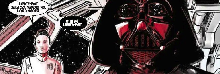
The red, white, and black format of the comic book doesn’t actually do anything for it. It’s fun and everything, but it feels more like a visual gimmick than anything. Kirk’s art in the first story features a rich, dark brownish red that doesn’t feel too interruptive, but Raffaele’s beautiful work at the issue’s end seems a bit marred by the bright red Smucker’s raspberry jelly that seems smeared all over everything in the periphery.

The limited color format is kind of...in the way of a decent anthology. It’s not the colorist’s fault, though. The format needs to be very carefully approached for it to mean anything at all. Otherwise, it just sort of feels...incomplete. Either make it black and white or full-color. Or have a compelling reason for adding the red into the black-and-white.