I Hate This Place #9 // Review
Trudy tells Gabby: “You should probably definitely not touch that.” Gabby touches it. Things get complicated from there in I Hate This Place #9. Writer Kyle Starks reaches the penultimate chapter in the weird sci-fi horror series drawn by Artyom Topilin. Color assists come courtesy of Lee Loughridge. The weird intensity of Starks’s end-of-the-world-style action cranks up the intensity for another 20 pages or so before the big climax due out next month. Though the art is thick and crude, the story has a rhythm and charm about it that keeps things moving briskly towards the end of the series.
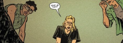
The thing that Gabby’s touching shocks her. She has visions. When she comes through the visions, she understands them. Evidently, the thing that she touches is a key left on Earth by extraterrestrials who came here hundreds of years ago. It can turn on a machine that can reshape the Earth itself. So it’s a pretty important piece of tech. To complicate matters, there are soldiers from the future who want Trudy and Gabby dead. They’re ready to do what they have to do, but they’re going to have to get through the horrors of Trudy and Gabby’s place first…

Starks is working with sci-fi time travel tropes and ancient alien technologies and a hell of a lot of other stuff that continues to be really, really familiar to anyone already familiar with the genre. Starks isn’t doing anything new here, but he’s putting it to the page in a way that focuses on the specific concerns of the characters caught in the middle of everything, so it continues to find its own gravity even though it’s playing in territory that’s pretty much been explored to death in other works in and within the genre.

While it’s pretty far from being indecipherable, the crude and gloopy art of Topilin feels like a rough draft. Action, emotion, and intensity are brought across quite vividly, but they’re all carved with graceless motions that appear uncomfortable on the page. There’s a strikingly organic quality to the visual reality of the series that lacks the kind of grace that might amplify the appeal of Starks’s story. The emotive and expressive feel of the artwork might take a little while to get used to every issue, but it IS preferable to more technically accomplished art that might lack some level of personality and motion.

There’s a point in any action story where it feels as though things have gotten so completely out of hand that there’s nothing for the heroes to do but embrace the chaos and swing through to the final encounters. Starks and company take that moment and stretch it out into a full issue. It’s a fun moment for the series, but it seems to get in the way of what really SHOULD be a more appealing issue of the series.