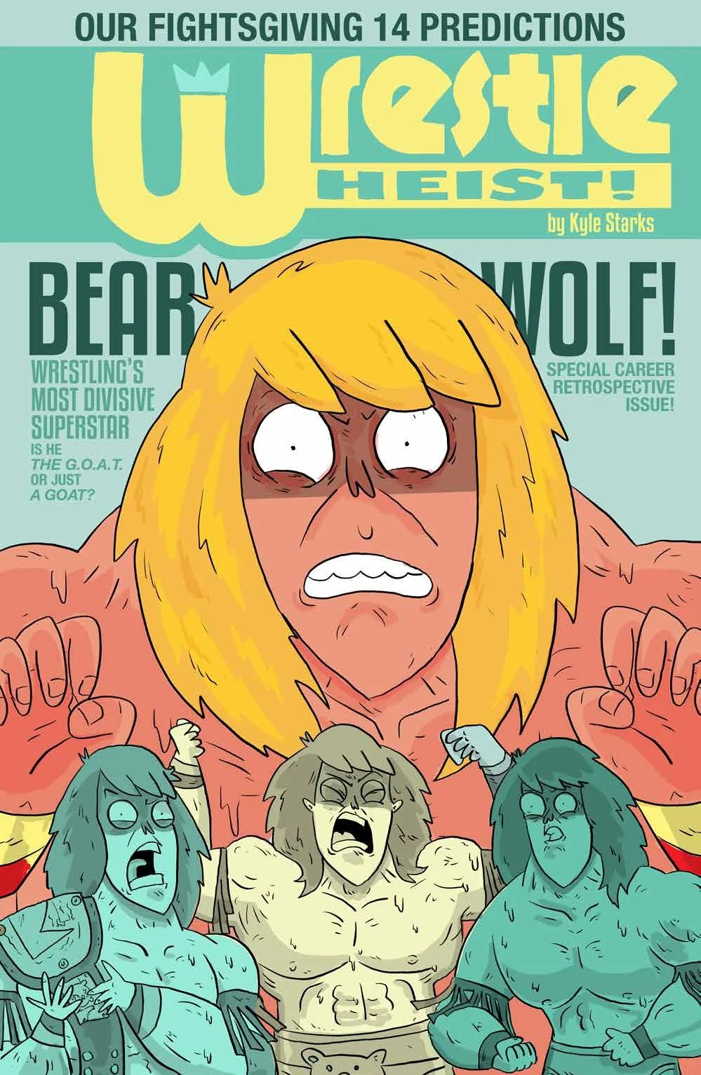
Wrestle Heist #4 // Review
Mr. Hansen and doesn't have a whole lot of time to talk. He's just going over the script with the two wrestlers in question. One of them has some ideas as to exactly how to execute what it is he wants in the script. However, Mr. Hansen just doesn't have time for it. He's got a lot of things to worry about. Not the least of which is the fact that the credit card readers just aren't working in the venue. This is a big pay-per-view thing. This is Fightsgiving XIV. Things heat-up in Wrestle Heist #4. Writer/artist Kyle Starks reaches a major turning point in his story with colorist Vlad Popov.
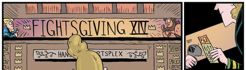
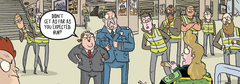
With all of the credit card readers down, everything has to be cash. And given the size of the event, there's going to be a lot of cash flow around. Every 45 minutes security collects the money drops from the arena merchants. That's going to be a tremendous amount of cash. All they need to do is managed all of the incredibly difficult and convoluted security protocols and make it into the safe. Period. And how difficult could that be for a group of guys weren't necessarily at all familiar with this sort of operation?
Starks works quite well with the traditional heist storytelling style. The rhythm of the action features just the right mix of planning, execution and plot twists to keep the reader engaged from cover to cover. And then there's that cliffhanger ending. It's actually quite well executed from beginning to end. There's just enough characterization for everybody involved in the heist to deliver some sense of emotional connection with them and what's going on with them. And of course, Mr. Hansen comes across as a very dark and respectful villain. It's actually a very well balanced script.
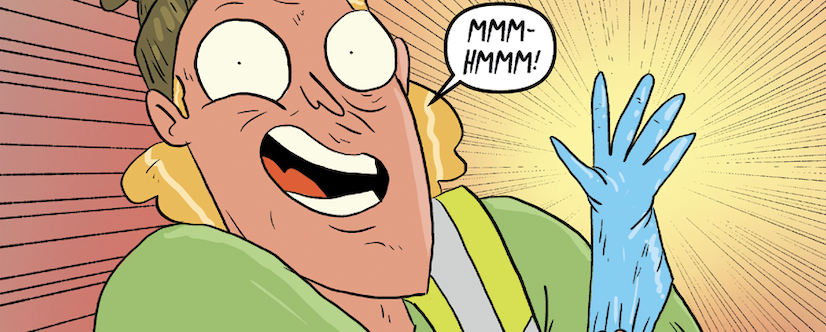
As always, the art is a little difficult to get used to. The scribbled nature of the art style is kind of a hurdle to get through. The script is so written that it would sort of benefit from more of a precise drawing style. But the cartoonishness of Starks’ style is not without its charm. And certainly there's a very dynamic sense of perspective about the facility in which the heist is taking place. There's a real sense of intensity there. It's just too bad that the style is as overpowering as it is.
The art style wouldn't be such a problem where it not for the fact that that the script is written with such striking precision. The artwork lacks the kind of precision that Starks manage in his script. As a result, it doesn't really have the kind of impact, but it could. So it feels kind of weak. Nevertheless, it has a very distinct presents on the page. And it feels very much unlike just about anything else on the kind of book rack right there's something to be said for that. Real enjoyable departure for much of the rest of what's being offered right now.