

Rifters #2 // Review
The authorities are in pursuit. The perps they’re tailing are wanted for inter-time bootlegging, unauthorized time travel and timeline disruption (among other things.) It’s just the first scene in Rifters #2. There’s really no questioning that they’ll bring the perps-in, but it’s going to be a hell of a mess as writers Brian Posehn and Joe Trohman make it to the second issue of the series with artist Christ Johnson and colorist Mark Englert. The overall rush of action is pretty good, but the dialogue feels kind of silly in a series that feels like it could be a bit better with better scripting.

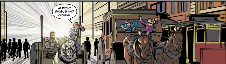
The perps in question were rolling through the early 20th century. The rioters damn near got run over by a Studebaker before getting their men. And they didn’t exactly clean-up their crime scene all that well. A chain of causality turned The Flash into “The Speed,” who ended up looking a hell of a lot like one of the Rifters. They don’t have much time to wash off the filth before they find themselves sent out to San Francisco 1906 to deal with a couple of time travelers joyriding in a horse and buggy.

Oh christ...the dialogue is awful. I mean really, really bad. They’re trying WAY too hard to be funny and it actually gets in the way of decent art and a pretty solid script. It’s not like...brilliant or anything, but it’s a solidly fun story with a fast-paced feel to it, but the dialogue drags it down and makes art almost feel totally unreadable. The basic premise of Rift Police is actually a lot of fun and the pacing of the story keeps it all quite fresh, but I mean...the dialogue is.....REALLY bad. (Really, really.)

Trohman frames the action quite well. There’s a hell of a lot of pursuit going on in the issue, but Trohman keeps it from feeling too overwhelming. Sometimes the action is bolting at the reader. Sometimes it’s bolting away. Sometimes it’s shooting to the side. And above all the emotional end of the drama is...well it IS over-exaggerated throughout the issue ,but that’s not really a problem. It gives some punctuation to all that running and rolling and hoofing. The level of detail feels respectable and there’s clearly a great deal of research made into fashion and architecture of the eras in question, which makes for a fun visual adventure.
And then there’s the dialogue. Which is honestly some of the worse that’s been featured in a major comic book in the past five years or so. I mean...wow. I guess on some level it would be kind of okay to have people sounding this silly if all the forced humor was offset by something that attempted to be a bit more serious in tone. Like maybe...maybe if the two main characters were the only ones who sounded like idiots, it would be cool. Instead...it’s just bad.


