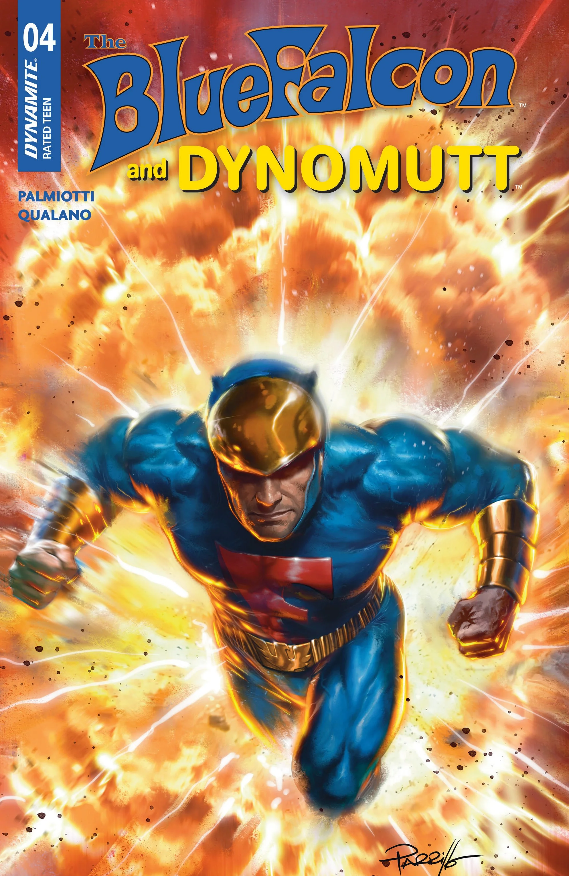
Blue Falcon and Dynomutt #4 // Review
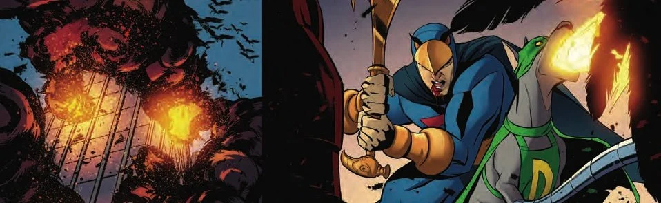
It’s not clear who is attacking them. It IS clear that the one who is targeting them has a lot of funding. They’ve already done away with a lot of the enemy units and there are another 600 on their way. Good thing that it’s only a dream sequence that’s opening Blue Falcon and Dynomutt #4. Writer Jimmy. Palmiotti and artist Pasquale Qualano continue their revival of the old animated hero from Saturday mornings with the aid of colorist Jorge Sutil. It’s a fun reimagining of the character that gets into the heart of a buddy action story between a man and his dog.
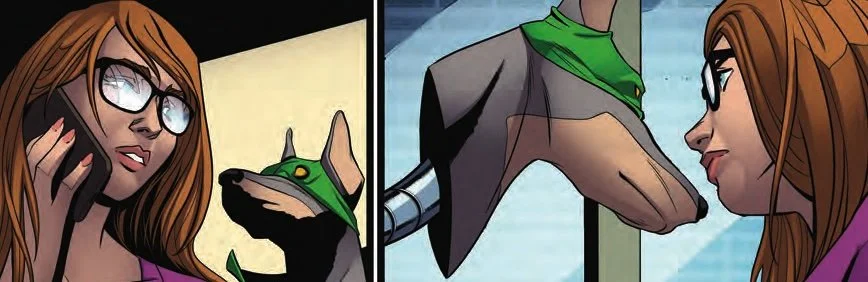
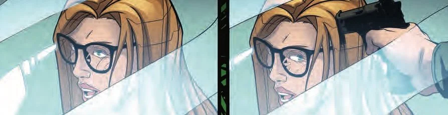
Blue Falcon was in the hospital. He was in no position to defend himself when that hospital was invaded by those looking to target him. Thankfully, Dynomutt was there to help defend him. Now he’s back home, but he’s missing an anti-gravity belt and there is some suggestion that the woman who made off with it just might be unscrupulous enough to try to do something sinister with the technology. Maya Vincent knows just where to find the individual in question, but she might be walking into a hell of a lot of danger if she’s going alone...
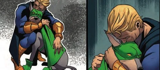
Palmiotti Pace is the issue almost perfectly. Everything seems to fit together really well from one scene to the next. The mystery of exactly what it is that's going on and gets a little bit clearer. And the villains remain villainess as the heroes remain heroic. It's very well balanced, even if there isn't necessarily a whole lot of depth to it. Palmiotti is taking a Cheesie kids action Saturday morning package and turning it into something that feels like it wouldn't be at all out of place with a more sophisticated audience that would have outgrown the series that spawned it.
There’s a fun precision to Qualano’s artwork that serves the story quite well. The artist managed is to find some very clever angles with which to deliver the action from. It's all very well executed in a whole bunch of different ways.Sutil’s colors lend a great degree of depth and texture to an issue that features some very detailed backgrounds. And it's own way of issue feels very immersive. That immersive lens a great deal of impact to the action as it shoots across the page. Visually its a remarkably appealing issue even if the title character doesn’t have a whole lot of opportunity to move around on the page.
Blue Falcon’s home of Big City always seemed like a strange joke. All of the good super hero city names seemed to have already been taken. And if you're going to create a fictitious superhero city at any point after the 1960s, it seems like you might as well just call it something generic. Palmiotti and company are doing a really good job of creating a kind of atmosphere about the city that makes it feel distinctive and unique. This goes a long way towards making the character seem a little bit more sophisticated.