

G.I. Joe #15 // Review
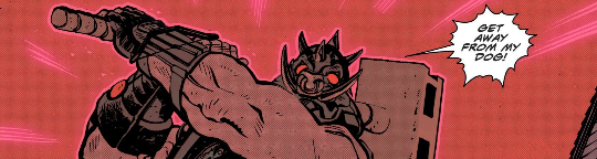
Duke is chained-up by the wrists in a shack with a stranger. The gentleman who has Duke and the stranger captive is a big guy with a pig mask who seems at least marginally invincible. The stranger he’s captured with doesn’t exactly identify as human, but it’s not like he isn’t. So..y’know...there’s THAT to contend with as well. Given the kind of life he’s been leading, it’s not actually the worst place he’s ever been, but it’s not exactly a good situation in G.I. Joe #15. Writer Joshua Williamson and artist Tom Reilly continue an enjoyable action serial with colorist Jordie Bellaire.

Duke isn’t the only one forced to deal with Road Pig. (That’s the guy in the pg mask.) The Dreadnoks have come to confront him as well. They might have a bit of a problem with a guy like him who looks like something out of a Mad Max movie, but when it turns out that he likes grape soda just as much as they do...well...Duke’s going to have a few more problems to contend with. Meanwhile, Baroness, Risk and Stalker are on a recovery mission in Chicago that just might be a bit more than any of them had expected.

Williamson continues the action in a direction that feels progressive. It's always nice to see an issue like this that feels a little bit more like a standard action story than an all-out war sequence. Heroes and villains get mixed together with random elements that don't necessarily fit the mold. And it's kind of fun to see it happen. It might feel like a bit of a drag in comparison to other things that have been going on recently, but sometimes the action needs to slow down and fall ino strange territory with a guy in a pig mask.
Reilly focuses the center of the panel on the action and some of the drama. The characters really are the center of everything for this series. This is particularly good where the script calls for action and tention. The atmosphere is brought to the page by Jordie Bellaire with colors that occasionally red or a little bit of death, but mostly render a hell of a lot of mood. Rather than going with a straight ahead rendering of all of the color in high Fidelity, she's washing a stylish kind of mood across the panel that goes a long way towards making it feel more like art than a traditional action comic book.

Williamson and Company are really looking at the long-term in this series. It's taking a while for things to develop beyond the standard sorts of storylines that would've been around in the 1980s, but it's really nice to see the larger scope of the continuity in the Energon Universe beginning to assert itself more and more as the series continues. Given the right momentum. This could still be something much more than what had been originally developed for page and screen back in the 1980s.


