Peter Cannon: Thunerbolt #3 // Review
A pair of men are discussing philosophical matters involving perception, reality and identity. They fact that they’re doing so in colorful costumes is interesting. The fact that they’re soing so while attempting to beat the hell out of each other? That’s just weird. But it does’t make it any less brutal. Theoretically it could be a fight to the d eath in Peter Cannon: Thunerbolt #3. Writer Fred Van Lente and artist Jonathan Lau ar joined by colorist Andrew Dalhouse in a continued exploration into the latest revival of the Charlton Comics character who originally debuted in 1966.
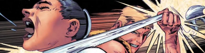
The blows being exchanged between Peter and his opponent are powerful. They appear to be quite evenly matched as kicks and punches and abstract concepts are swiftly hurled between the two combatants. There is a complex strategy at work that goes beyond anything that's happening between the two people either conceptually or physically. Peter's opponent really needs to discover something very important about him. And it's just a matter of time before he discovers all too well when he probably already knows. Precisely what happens from there is going to depend on how Peter and his opponent react to some very stressful situations in a very short order.
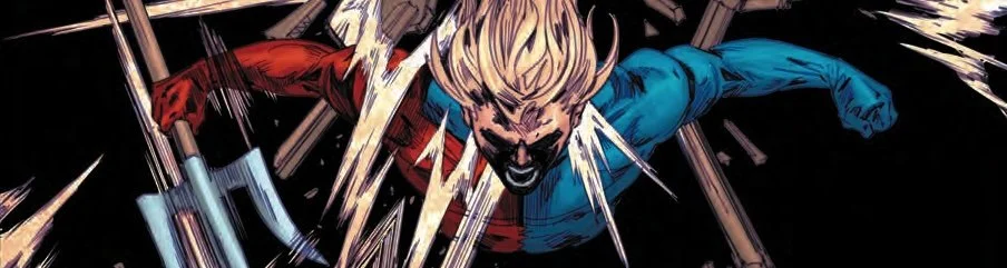
Fred Van Lente a mixes quite a few different elements into a big, climactic chapter in this series. Not all of it seems to be working perfectly well. That being said, it's impressive to see this sort of thing attempted on any kind of a decent scale. The martial arts combat between two people who are also philosophizing as they do so could come across as being completely silly. But it doesn't. It actually feels kind of refreshing in light of the way conversations during combat tend to play out in mainstream superhero comic books.
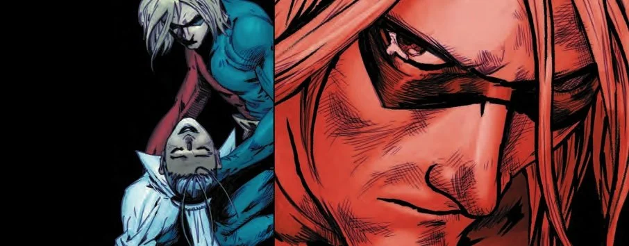
Lau and Dalhouse deserve a lot of credit for simply being able to deliver martial arts action in a way that makes it seem truly superhuman. That's not always real easy to bring across on the comic book page. The color by.Dalhouse fuses, the radiance of magic with something that feels a lot more earthbound in the shadows and around the edges of the action. Certain dramatic weight is carried quite well across the page. There is a great deal of intensity in both the action and the drama in this particular issue. Though it feels a little stiff in places, the overall momentum is carried quite well.
Fred Van Lente and company do a really good job of completing the opening frame of a very satisfying reimagining of the Silver Age hero. There are interesting social aspects being explored in a series that seems to be embracing a mixture of a few different elements. There isn't a sense of Silver Age good versus evil simplicity about the execution. It all feels like it's put together quite well on the page. There is a great deal of death. But there is an optimism about it. That feels really refreshing.