

Absolute Batman #21 // Review
The guys in the huge mecha-armor are up against one guy with horns, a cape and an archaic weapon. Nevertheless, there’s some concern about the situation as the guy with the horns is something of a legend. They’re being told that he’s just a man. That man is going to need more than just legend if he’s going to survive Absolute Batman #21. Writer Scott Snyder pushes his way through a few gritty action hero tropes with artist Nick Dragotta and artist Frank Martin. The series continues to drift toward developing a new way of looking at an old character.
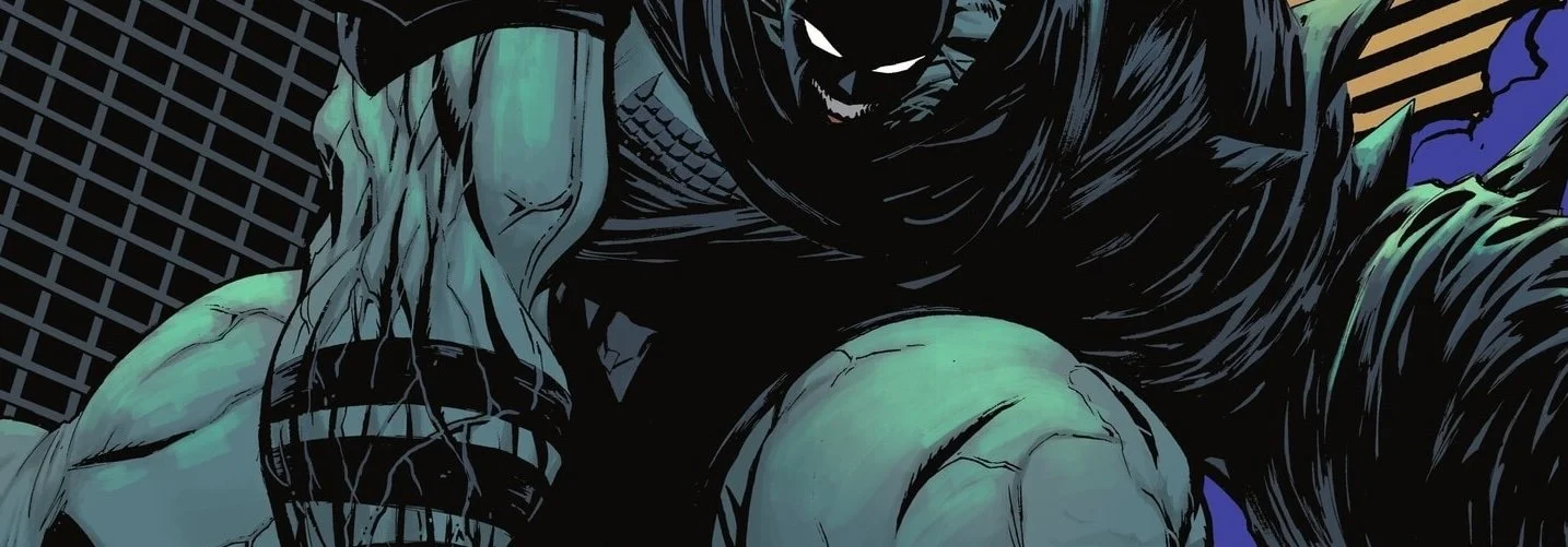
Batman is being given his final warning. He’s being told that the odds are bad. “These ARE bad odds.” He says. “For you.” And as he speaks these words, he’s grinning with a tiny, little head that could easily fit inside either one of his massive fists. Muscles and veins are all over the place on a body that seemed a whole lot less surreal on the previous page. That’s kind of a dead giveaway that he’s much more of a threat than he might appear on first glance. He’s just one guy, but the mechas are going to have a hell of a time bringing him down.

Snyder tells a traditional sort of action story pretty well. There is a whole lot of depth to the story. The drama seems interesting enough. But it doesn't have the kind of complexity that would make for a more satisfying story. A big and meaty Batman gets pummled around a bit. He's clearly accomplished something. And then he goes back into work the next day. He's just standing out there at the construction site on a girder hanging over the street. Is one of the more visually engaging moments in the issue, but the drama that follows isn’t really all that interesting.

There's actually a combat scene on a single steel gutter high above Gotham city. The visual intensity of that is actually really cool. And it's really cool in a way that doesn't require a whole lot of dramatic framing or anything like that. Not all of the action is as visually, appealing as that, though. And though it’s largely rendered for the page with a clever sense of percussive aggression, there are bits of it that are just kinda goofy. Dragotta’s big Liefledian opening splash page for the issue is particularly silly-looking.

There is something to be said for turning a lithe sinewy and clever detective into a big haphazard chunk of raw meat that get slammed around the panels for 20 pages or more, but that sort of thing has been done better elsewhere. There's clearly our love of Frank Miller’s style that is painstakingly slammed into the page. It’s been a long time since Dark Knight, though. Snyder and company are going to need a lot more inventiveness if they're going to be able to build this title into something more memorable. Honestly, though, it doesn't really matter. It's selling really well. I guess that's the most important thing. It's too bad it’s not a more cleverly-rendered story.


