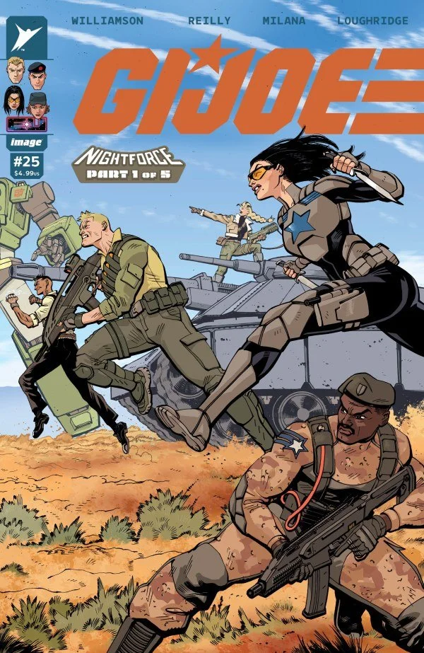
G.I. Joe #25 // Review
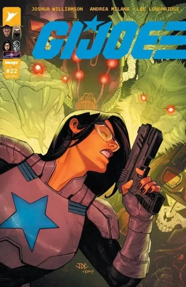
Colonel Hawk looks...different. There’s something that’s happened to his eye, but there’s something deeper in the way that he’s carrying himself that seems fundamentally different. The Baroness looks a bit concerned. Then he throws a rathe large tactical knife at her and she’s concerned about something else altogether in G.I. Joe #25. Writer Joshua Williamson reaches a major turning point in his new Joe series with the art team of Tom Reilly and Andrea Milana. Color comes to the page courtesy of Lee Loughridge. It's a big double sized issue that opens up a promising five-part plot arc.
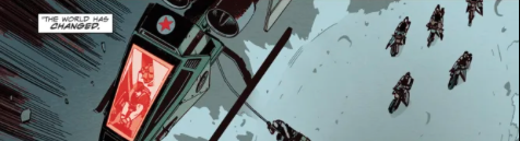
The Baroness has decent reflexes. She has little difficulty catching the knife that’s thrown at her. Of course...even then she might not have expected the Colonel to jump at her and attack in hand-to-hand combat. He knows that she’s going to be in a defensive position, so naturally he’s going to alert everyone over radio: the Baroness is working with Cobra. She has been doing so all along. She should not be allowed to escape. She knows that they’ll be able to see through his lie, but...she needs to retreat or things might get really dangerous for her...
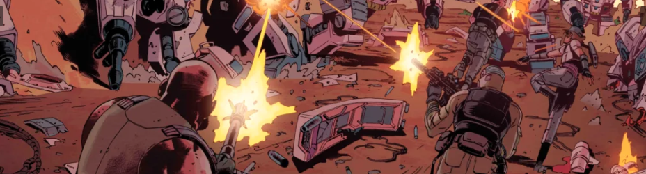
It's really difficult to play with loyalties and allegiances in a property like G.I. Joe. it's been around forever and they have been very few attempts to truly manipulate a basic good versus evil aspect of the series trying to endure a little bit more complexity and things run the risk of feeling cheap and fabricated. Williamson does a really good job of being through the characters while increasing their complexity and making it all unexpected unbelievable. That's not an easy thing to do given the nature of the characters and the nature of action-based storytelling. It might not be perfect, but Williamson is managing it quite well.
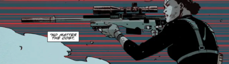
There’s a hell of a lot going on in the midst of the 25th issue of the series, but there’s little questioning that the Baroness is the center of it all. Reilly and Milana managed to make her the center of the issue without placing her in the center of every panel. Our presence on the page is powerful enough. However, they're going on in session about how elusive she is. So she manages to claim to the edges of the panels in a way that makes her feel like maybe she's not actually the center of this or even though she clearly is. It's a very clever use of layout that is suis subtle that it almost seems subliminal.
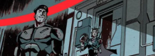
Above all, Williamson and company manage a very tightly crafted piece of adventure fiction. All of the movement in the issue is movement forward. There really isn't much of a chance for the reader to catch their breath. It all keeps moving forward, kinetic even in those moments where people are trying to figure out what the hell is going on those moments of discussions still managed to feel very strong and urgent even though they’re pauses in the kinetic action of the issue. It’s all quite well-executed.