Final Boss #9 // Review
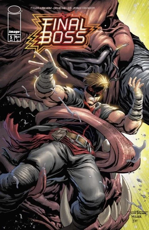
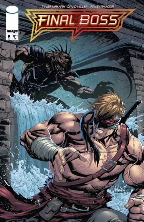
A muscly guy wearing a red mask grimaces into the empty space of the panel as he wields a single-handed sword that’s well over half as tall as he is. There’s a weird spatter of bloodthat stretches out across the page. This isn’t just any fight. This is a fight somewhere in the middle of Final Boss #9. Writer/artist Tyler Kirkham gouges another conflict into the page with the aid of fellow artist David Miller and colorist Ifansyah Noor. There's clearly something going on here. There's also a lot of blood. And muscle. And grimacing. There is also the supernatural.
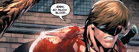
Blood. Muscle. Teeth. Hair. Scales. All of these things seem to almost sort of be moving across the page in a fight. Man fights, man-like reptile and a place that's meant to resemble a rather ridiculously large sewer. This is clearly a fight of some sort. And that fight clearly means something. As does all of the dialogue. The hero’s friend is in danger. The hero’s friend is defiant. He's producing a lot of blood as well. There's a little doubt who's going to win. There's a little doubt that there's going to be some kind of cost to it all.
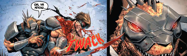
Kirkham’s story grimaces and punches and slashes and grimaces and shouts its way across the page. And then it does so again. And again. There's almost a sort of a progression to it. There's almost some sort of a conflict going on. It's kind of difficult to tell. There's just too much blood and muscle and shouting and grimacing. And what with it being nine issues in already, the author hasn't done a whole lot to distinguish the main character as anything other than a lot of muscle and blood that moves across the page while grimacing.
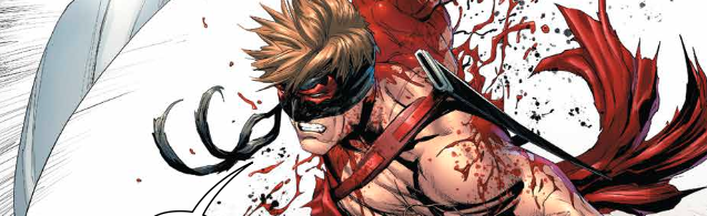
The overall lack of anything coherent or original in the script would be a minor concern if the artwork was brought to the page in a way that was compellingly brutal. As it is, it's just kind of boring. There isn't a powerful sense of kinetic force behind the slashing in the punching in the shouting. There are a lot of close-ups. There's a lot of blood. There's a lot of muscle. Noor’s colors do a lot to help establish mood and tone and volume. That much is actually pretty cool. But it's hard to do much when it's all just moving across the page without much of a sense of coherence about it. It’s like Michael Bay did a comic book.
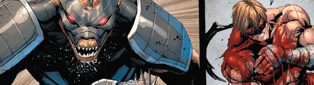
Again: there IS a way to make mindless fighting look cool and appealing and impressive on the page. Big and dumb and stupid CAN be breathtaking when it’s captured for the page in a way that feels compelling. Kirkham seems to be totally avoiding this...almost on purpose. He’s got all of the right elements in place to make it all work, but he’s totally failing to do so. It’s actually kind of funny. Or it might be if it was just a littl bit more interesting.