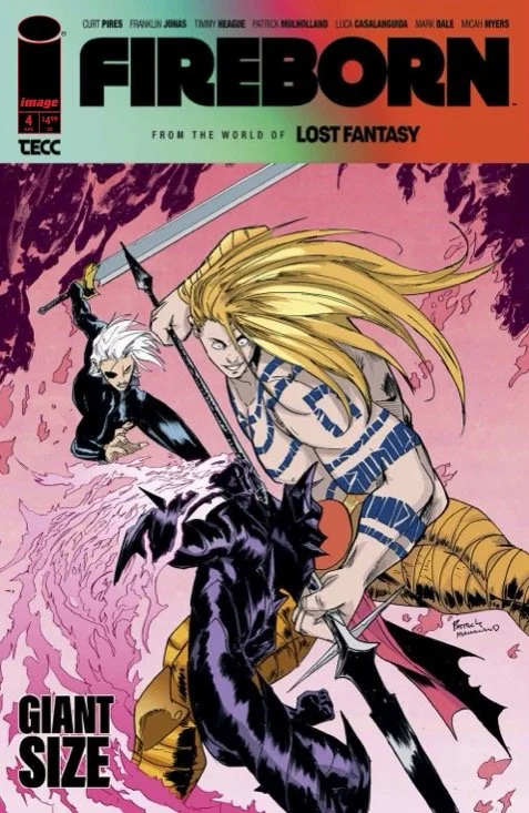
Fireborn #4 // Review
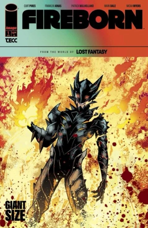
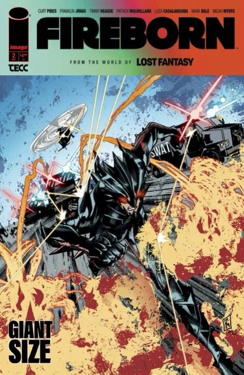
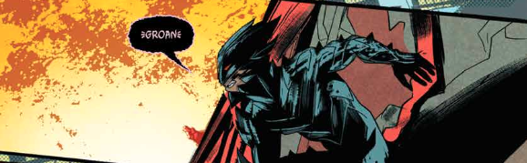
He can be seen in the back of a picture taken between a couple of friends. They're posing against the skyline. Away in the back, you can see a streak of blackness. The people who turn to look might see a tiny figure of pure black ricochet off a couple of buildings and into a metropolitan bus. Surprisingly, he gets up. The bus driver is a little shaken. But he's OK. Even has enough sense to mention to the gentleman how ridiculous he looks. Insults aren't all he has to worry about in Fireborn #4. The writing ream of Curt Pires and Franklin Jonas continue a series that’s brought to page and panel by artist Patrick Mulholland and colorist Mark Dale.
The man who attacked Aaron Hillburg looks at least as ridiculous as he does. He’s towering over the street with ridiculously huge muscles and gleaming, long golden hair that looks like it’s seen a great deal of product. If the absurdly large and horribly bemuscled kaiju of a human being isn’t trying to kill Aaron, he’s doing something wrong. Because it really, really looks like he’s trying to kill him. Aaron isn’t holding-up much of a defense. He’s going to need some help.
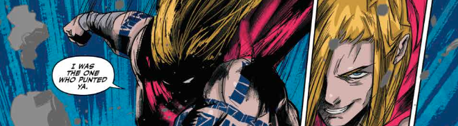
Jonas’ story doesn’t hold a heck of a lot of interest beyond the basic appeal of super-powered buys fighting and chewing-up scenery. The fact that there’s a bit of a hipster bent to the story would be a little bit more appealing if the dialogue was just a little bit crisper. As it is, the fourth issue of the series is so close to being at least reasonably cool that it’s actually pretty frustrating that it’s not. There’s so much potential in the overall feel of it. It’s almost there. Really. Jonas only needs to nudge it a little bit to make it impressive.
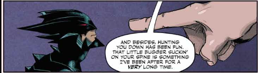
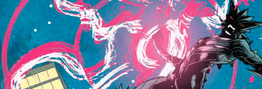
Mulholland does a lot of of the heavy lifting to make the issue feel as a feeling as it does. The action shoots across the page with bone drying intensity. The overwhelming in fact of ridiculously powerful characters attacking each other can be something that can be very difficult to bring to the page in a way that feels so fresh or original. Mulholland it makes it all look really good. It's not terribly memorable visually. However, there is quite a bit of impact with everything that's going on on the page. And there is a stylishness about it that feels appealing.
An unsuspecting guy gets power beyond belief. And he kind of needs to have to deal with it. Because suddenly people are attacking him. This sort of thing actually happens a lot in science fiction and fantasy. It's hard to do this sort of thing in a way that feels like it's anything other than an echo of an echo of a copy of a shadow of something else. Given how derivative the basic story is it's really interesting that Jonas and company are able to do anything with it at all. It's fun, though.