Hammerfist #1 // Review
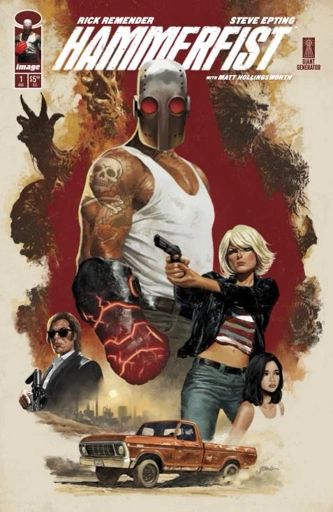
There’s a guy watching TV in Lovelock, Indiana. His place is a mess, but it’s not exactly the type of place that very many people take prie in. It’s not really worth that much to him. Clearly. There are dishes piling-up in the sink. Discarded bottles all over the place. He doesn’t know it yet, but his life IS worth something. He’ll never know that his life is worth $60. He’s only the first encounter in Hammerfist #1. Writer Rick Remender opens a whole new series with artist Steve Epting. Color comes to the page courtesy of Matt Hollingsworth.

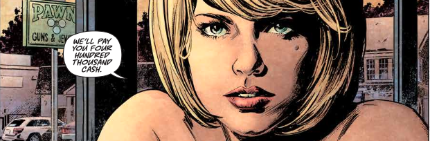
The woman who paid the hitman $60 for the murder of Vernon Stubbs also offered him sex. The hitman wasn’t interested. He preferred the more squalid comfort of his own car that night. The next morning there was a knock on his car window. A couple of people were offering him money for a bank job. (It was a Savings and Loan, actually.) It’s not only significant in that it’s one of the 600 S&Ls remaining in the U.S. It’s also significant in that the people who have hired the hitman might not actually be in it for the money...
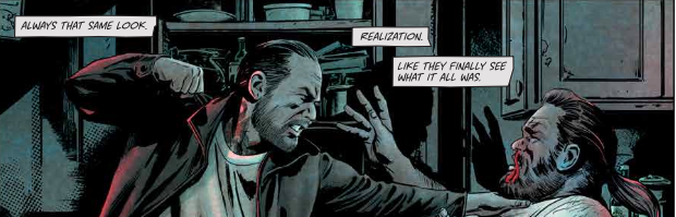
Remender really pushes this squalid in this one. He's a pretty versatile writer with an impressive range. Here he's going solidly for the gutter. But there's a definite theme of something bigger. Something more elevated. Lots of talk of religion and spirituality. Judging from the first issue, it's a story about people who are in the gutter and looking at the stars. However, it isn't just situated on a dirty street level. There's a supernatural end to it that is clearly shooting it in a completely different direction than the small-town gutter punk milieu that serves as its foundation.

Epting’s gloopy inking washes out a lot of detail. But it's not the type of detail that you would really want to see anyway. And so it fits and suits the overall theme and atmosphere of the series is quite well. It's a blurry look at the discarded detritus of the American dream. The problem is that the art doesn't modulate enough when in the presence of something truly supernatural or spectral. As a result, of the magic that's there doesn't contrast strongly enough against everything else to really feel like it's truly magical. Hollingsworth’s colors cling to the squalor in a respectable gesture of kinship with it.
It's still really early to tell quite exactly where it is that the series is going. The mixture of mysticism and religion and the cheaper nature of a life in the lowest possible tax bracket feels like it could be really interesting if it's explored in the right way. It is, however, entirely possible that it could turn into less appealing art damaged mutation of Witchblade. Time will tell. Remender’s got a good track record, though. It seems likely that Hammerfist will go in a more interesting direction.