

Sonata #1 // Review
A young immigrant to a strange world is drawn to conflict in the first issue of the new pulpy space fantasy Sonata. Writer David Hine opens a space fantasy story with the aid of strikingly textured art by co-writer Brian Haberlin. Color comes to the page courtesy of Geirrod Van Dyke. Though the story is a vague mishmash of various pulpy space fantasy stories, Haberlin’s art is atmospheric enough to make Sonata stand out on the rack. It’s an interesting first issue that could lead to even more interesting directions as the series continues in the months to come.

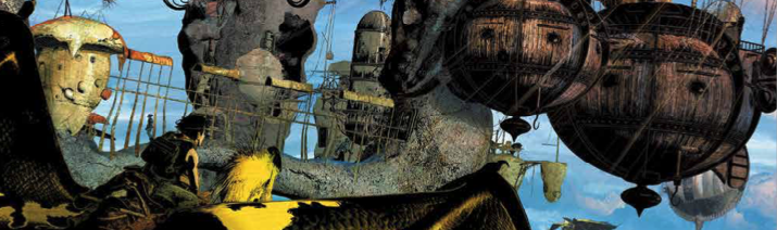
The story takes place on the planet of Perdita--“The Lost World.” The establishing monologue is delivered by the title character. She’s from the plant of Ran, which is running out of resources. Once every five cycles, Ran comes in close proximity to Perdita, allowing for more Ran colonists to arrive on the beautiful, dangerous paradise. Sonata aids in colonization on the back of a giant bird called a thermosaur...helping arriving colonists avoid the dangers of the local wildlife. When colonists from an industrialized planet start hoarding water with a massive dam, an indigenous race suffers potential drought, prompting a conflict between the Ran and the industrial colonists.

Hine and Haberlin draw from various places for a very simple story of “good” ecologically-balanced colonists in conflict with “evil” industrial hoarders who have come to claim land without sharing resources. The pulpy fantasy of the plot can be forgiven as the drama that it supports is interesting enough to prop up the narrative end of extremely appealing art. The title character isn’t given much to define her as anything other than the standard, young protagonist of a pulpy fantasy story, but the selfless adventurousness of her personality is clearly apparent in an interesting opening for the series.

Haberlin’s art is a grainy mix of textures and styles. The overall look of Sonata’s world is a mix of steampunk and fantasy. Sonata looks cool and Pern-like on the back of her theromsaur with welding goggle-inspired headgear and riding gear. The backgrounds feel atmospheric and photographic as high-res digital-looking textures and Van Dyke’s colors appear to coat everything in a natural evolution of computer graphics that have a pixillated detail that recalls Mike Saenz’s pioneering work on Shatter back in the mid-1980s. The cluttered, detail-heavy digital look of the Sonata might feel like a bit of a throwback to Saenz’ early work with MacPaint, but it definitely gives Sonata a very distinctive look that draws the reader into another world.
Obviously, the art team ISN’T using an old version of MacPaint to put together the visuals of this issue. The visuals are A LOT of fun for an opening issue of a story that shows signs of some genuine wonder and somewhat dazzling world building. The credits page mentions a behind-the-scenes companion app to the series which as of this writing isn’t available. It’ll be interesting to learn more about the process for the series once it becomes available.


