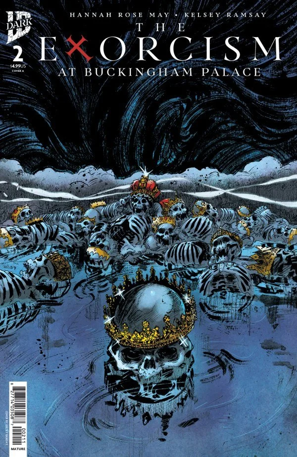
The Exorcism at Buckingham Palace #2 // Review
The H.M.S. Britannia has gone missing. The royals onboard are missing. They have yet to be declared dead. Nevertheless, an heir has been identified. The bad news is that he’s been drinking excessively. The worse news is that he seems to be haunted by something much worse than mere alcoholism in The Exorcism at Buckingham Palace #2. Writer Hannah Rose May continues her supernatural political horror drama with artist Kelsey Ramsay and colorist Heather Breckel. The author works with a richly textured and detailed complexity as mystery and horror lurk around the edges of political intrigue in a very contemporary U.K.
There’s a derby coming-up. The royals are expected to attend. There are a few missing, of course. The Britannia is still nowhere to be found and England is without its monarch. There IS, however, a prince who desperately needs to sober-up if he’s going to be able to assure the public that all isn’t completely in tatters at Buckingham Palace in the wake of the disappearance. There is a sinister shadow hanging over the royal family, though. There is talk of a curse that goes back many, many years. And then there’s the fact that the prince keeps talking about this...shadow...
Hannah Rose May has done a gorgeous job of constructing all of the different elements that. comprise the contemporary British monarchy in an age of social media and continued public obsession with it. The supernatural is quite clearly in sight throughout the entire second issue, but it’s always lurking around the edges of a very sober and earthbound political drama that continues to present itself as the dominant storyline in the center of every page and panel. Things don’t really dive into the supernatural darkness until the very end of the issue.
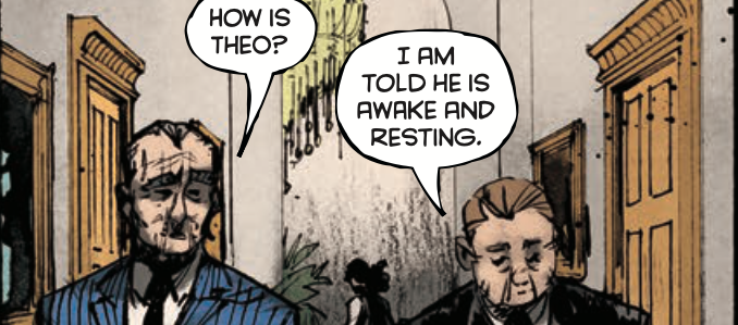
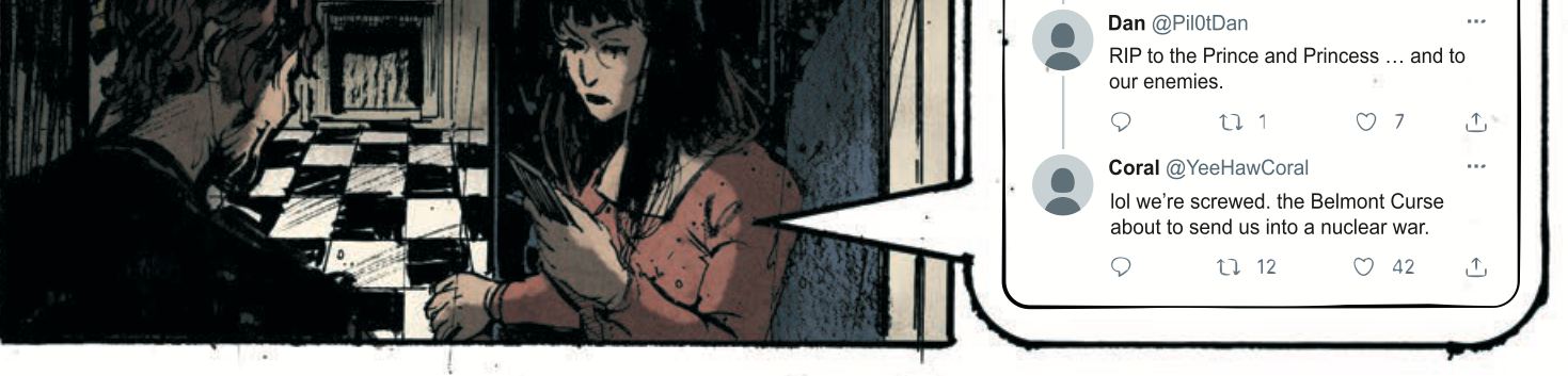
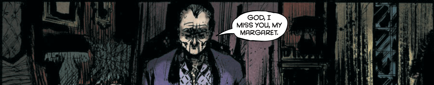
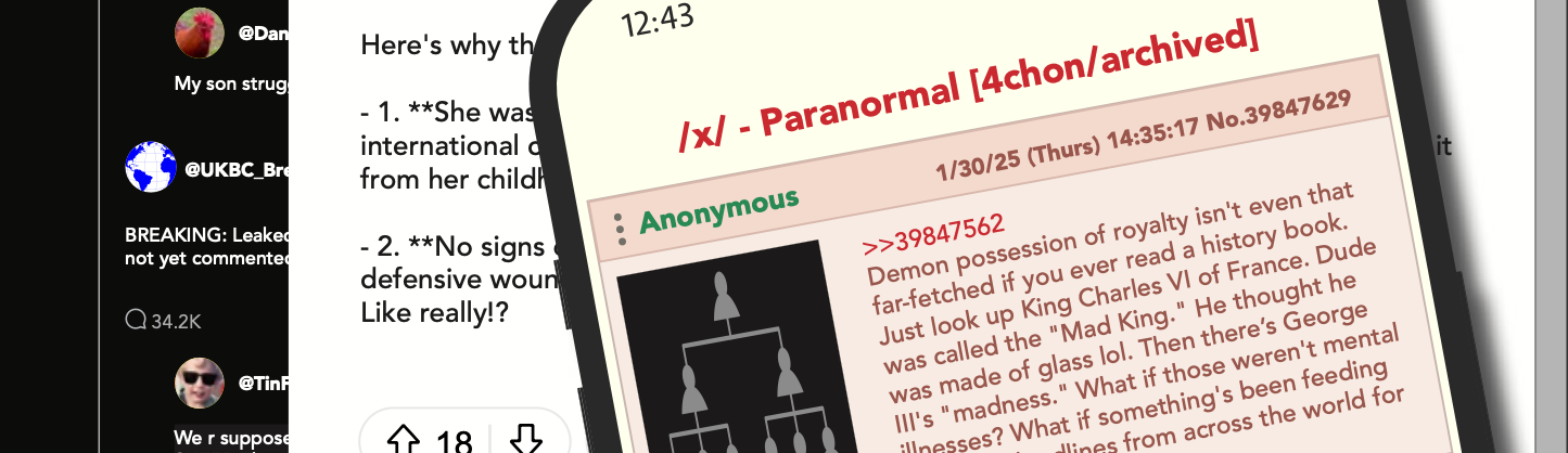
Ramsay coats every page with a scratchy inky darkness that clings to the page throughout the issue. Little flecks of ink punctuate the gutters of the page throughout the issue, adding to the gritty feel of the darkness. Generally, though, there IS a sense of decorum and formality about the fashions and the architectural rendering in the backgrounds. The shadowy moodiness of the visuals are also brought quite vividly to the page in Breckel’s colors. The color adds substantial depth in the shadow of the heavy ink that Ramsay is bringing to the page. It’s a well-articulated visual that also includes well-conceived layouts incorporating phone text chains, formal letters and impressively detailed social media screens.
Presumably, the series will start to focus more centrally on the supernatural darkness at the heart of the series starting with the third issue of the series. A delicate balance between realism and supernatural horror has served the series well. There isn’t a whole lot in the substance of the plot that’s terribly original. What makes The Exorcism so fun IS that balance between delightfully stuffy and formal political drama and darker supernatural horror. The creative team has done an excellent job of maintaining that balance.