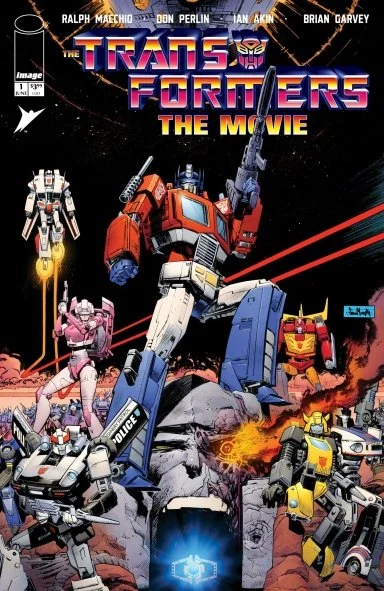
Transformers: The Movie #1 40th Anniversary Edition // Review
Back in 1986, Hasbro decided to promote a whole new generation of Transformers toys with a big budget feature-length movie for theatrical release. The movie had an impressive $6 million budget. (Pretty impressive for an animated feature at the time.) In keeping with tradition, the animated film would be featured in a three-issue comic book adaptation by Marvel. That series finds a new release for its 40th anniversary this year courtesy of Skybound and Image Comics. Ron Friedman’s original screenplay was adapted by Marvel’s Ralph Macchio with art by Don Perlin, Ian Akin and Brian Garvey. Color came to the page courtesy of Nel Yamtov with color restoration by Michael Kelleher and Kellustrations.
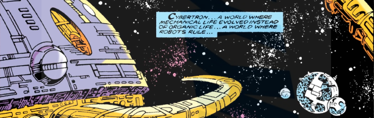
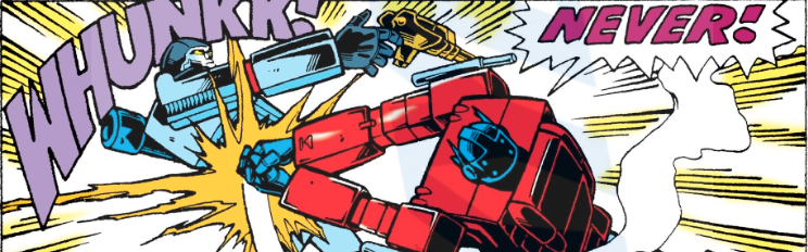
It’s 19 years into the future. (So...y’know...it’s 2005.) A massive planet-sized predator is eating other planets in deep space as the Autobots and the Decepticons continue to wage a war against each other that’s been going on for something like a quarter century. Megatron and his Decepticons manage something like a major victory as they eliminate a few Autobots. Even Megatron manages to nearly destroy Optimus Prime...but is nearly destroyed in the process. He would have been completely scrapped were it not for the influence of the planet-sized predator...which completely rebuilds him and gives him the voice of Leonard Nimoy.
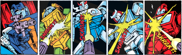
It's interesting to revisit an adaptation of a movie that has had such a strange history. Originally it was just intended as a way to sell toys. But there were people involved in the production who understood the significance of some of what was going on. Even they weren't going to be able to predict just how devastating the death of Optimus Prime was going to be. Though it's handled with some considerable weight in the motion picture, the kind of adaptation gives it only a couple of rather cluttered pages that don't exactly grip emotionally the way they should.
The art team for this particular book is huge. One would imagine that Marvel had received a mammoth amount of reference material from the animators of the movie. Nevertheless, it manages to feel quite a bit, rushed in comparison to the impressive level of detail that the motion picture managed. It's interesting to take a look at it again. The color, though…ugh. Kelleher falls victim to the same error that has been plaguing so many other contemporary reprints of comic books from earlier eras. The original color was presented on cheap newsprint, allowing for more of a muted and nuanced range of color. Kelleher doesn’t dial-down to the brightness at all for current printing/digital formats and as a result, the brighter end of the issue’s color spectrum looks ugly, garish and totally overblown.
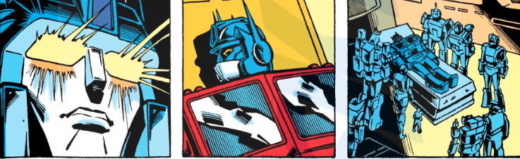
Some of the updated color work does create more of a sense of depth to the art. But the brighter end of the color is all too overpowering to make the re-issue feel like anything other than awkward. To their credit, Skybound and image are being true to the direct reproduction for the most part. This is particularly strange when it comes to the death of Optimus Prime. Nelson Shin’s emotionally engaging fade-to-grey color effect of Optimus Prime’s death is noticably absent on the page and it just feels...weird. The Marvel art team of 1986 could not have known the impact a scene like that was going to have and it’s interesting to see a treatment of it that shows the death of a major character in more of a casual light.