Teenage Mutant Ninja Turtles vs. Street Fighter #2 // Review
Raphael is beating the hell out of Guile. There’s probably some sort of misunderstanding involved. The ninja turtle is angry with the U.S. Air Force Major for reasons that end up feeling a lot like professional wrestling. Did he pay off the referee? Guile was as upset about the call as Raphael. The struggle continues in Teenage Mutant Ninja Turtles vs. Street Fighter #2. Writer Paul Allor continues a large ensemble slugfest with artist Ariel Medel and colorist Sarah Myer. It’s a graphically appealing video game/comic book fusion that does some justice to both art forms.
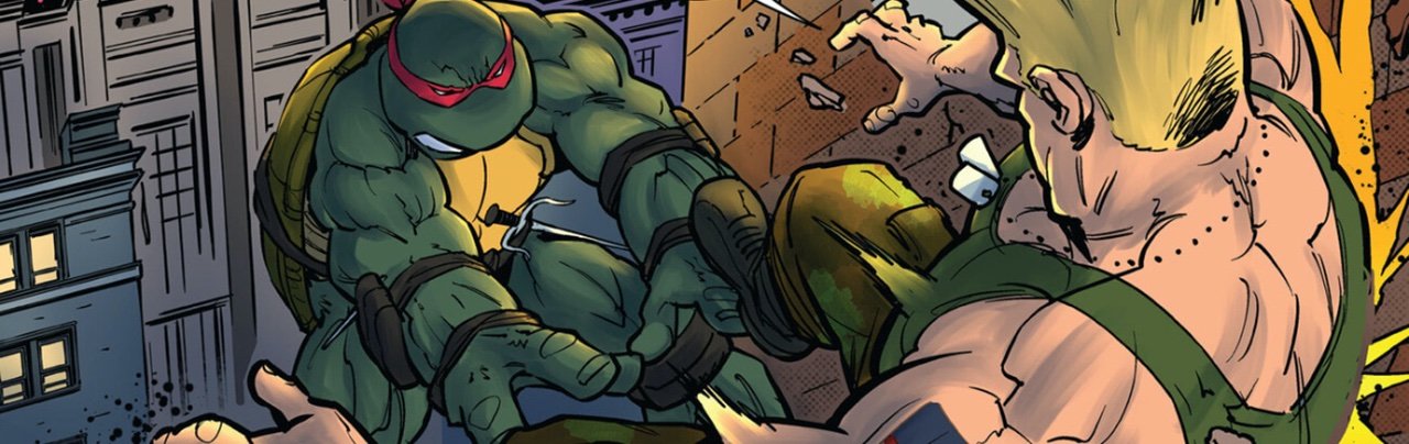
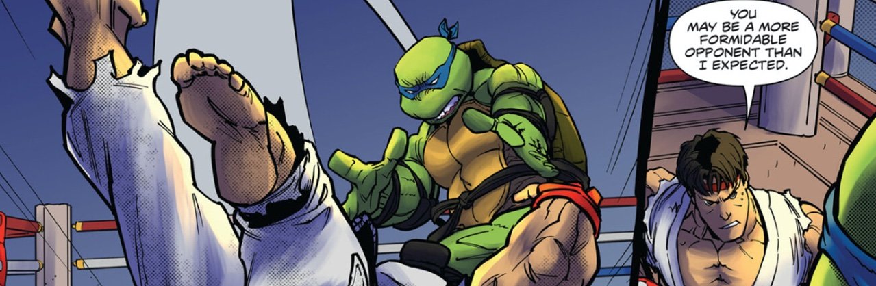
It’s not just Guile and Raphael in the alley. There are quite a few Street Fighters looking on. Then, a drone comes in and shocks them all into unconsciousness with a drone-based amplifier. The man responsible has a great deal to answer for. M. Bison is furious. He’s not exactly a guy ANYONE wants angry, so the lab-coated doctor in question better think fast. He might be a bit too concerned about others’ safety and not NEARLY concerned enough with his own. Elsewhere, Leonardo is drawn against Ryu in the ring. Karate master fights Ninja master as politics swirl about beyond the ring.
Allor keeps the dialogue simple and the story simpler in a big action issue with a traditional hero crossover plot structure. One group of heroes thinks the other group of heroes is a bunch of villains. They tussle. A threat arises that attacks both of them. And before long, they're working together. The fighting-ring-and-casino location of all the action keeps the issue firmly rooted in a place that has a certain amount of personality to it. Allor IS, however, working with a huge ensemble, and no one seems to get the right amount of time on the page.

Medel’s art is beautiful. The action is very percussive on the page without being repetitious. The artist manages to find a lot of different ways to deliver the hits without getting lost in the tedium of a series of fights. All of the aggression would feel like a big, mindless wallpaper were it not for the fact that Myer goes for blindingly bright and vivid colors. Why go for more natural color and more moody and nuanced tones when it's a bunch of people fighting? Everything hits the page with an electrically vivid range of color. It’s like the 1980s all over again. The visuals are pretty stunning given the fact that it's just a bunch of fighting.

One should not expect a terribly deep story given the fact that it's just a fusion of two highly marketable properties. There isn't anything terribly revolutionary about the way the action hits the page. It's just kind of fun to see an issue that is so dedicated to action for the sake of action. The issue reaches its end, and it doesn't really feel like there's been a whole lot of emotional engagement. But it's been fun.