

Batman: Gotham by Gaslight--A League For Justice #1 // Review
DC returns to its long-dormant, first-ever Elseworlds property for a second year in a row with Batman: Gotham by Gaslight--A League For Justice. Writer Andy Diggle establishes a solidly interesting 19th century version of the contemporary DC Universe with artist Leandro Fernandez and color artist Matt Hollingsworth. The novelty of seeing beloved and familiar characters translated into other settings has been overdone. Diggle does find some clever craftsmanship in setting and dialogue that goes a long way towards making this year’s entry seem appealing enough to keep the pages turning through another issue’s excursion into the 19th century.

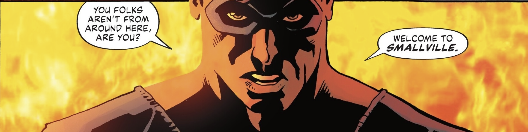
There’s a building burning in Smallville. A lone, masked figure stands alone in front of it. Four fantastic-looking figures face him. Tensions are high and they’re about to get worse. A gang led by a garish chalk-white girl has just emerged from the bank. The gang is about to make-off with a valuable artifact. Perhaps the group of fantastic figures might somehow find some way to band together and defend justice. It’s worth a shot, anyway. There’s no telling what might happen if they don’t set aside their differences and act together to protect the town.
Heroes meet and instantly take a disliking to each other before changing course to save the day. It’s a superhero cliche, but Diggle does a pretty good job of bringing it into the 19th century small town midwest. Diggle also manages to mitigate the tedium of seeing the same superheroes shot through yet another alternate Earth that needs to be formatted for another era. Much of Diggle’s success in making the whole venture palatable lies in his clever use of dialogue. There’s some really shape turns of phrase that almost feel Shakespearian in places. It might not be enough to make the whole thing seem remarkably fresh, but the dialogue IS good.
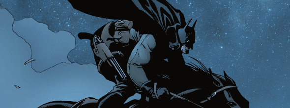
Small town 19th century midwestern drama feels right at home on the page with Fernandez framing the action. Some of the exaggerated intensity of the action might feel a bit awkward in places, but the overall execution has quite a bisual punch--especially where it is particularly amplified by Hollingsworth’s colors. The starry night sky over Smallville is gorgeous. The fire of the sheriff’s station at the beginning of the issue feels textured enough to ignite the page. Through it all, texture and depth are maintained by clever nuance in Hollingsworth’s colors.

Now that the team has been established, Diggle and company can settle-in and start to establish forward momentum for the plot. With all of the introductions out of the way, it’s only a matter of time before the specifics of the story begin to gain their own kind of gravity. The first issue WAS mucking about a bit in the tedium of establishing everything, but now that it’s moving forward, the series really has a chance to make a solid impression. It’s kind of a big ensemble to work with, but Diggle and company are doing a pretty good job of establishing everything.


