Exquisite Corpses #3 // Review
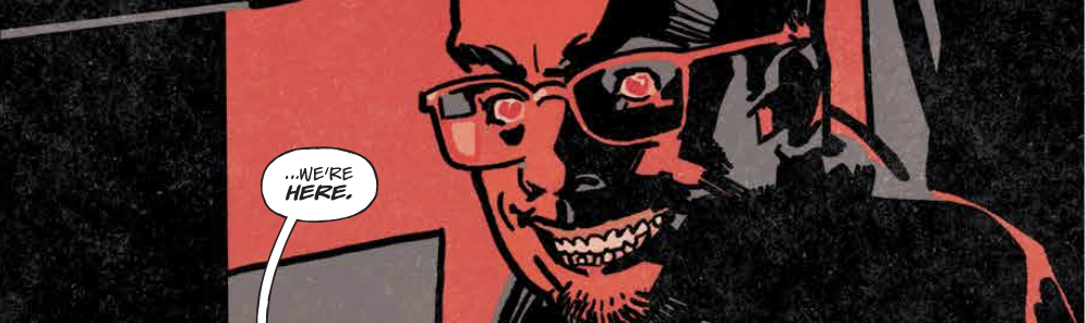
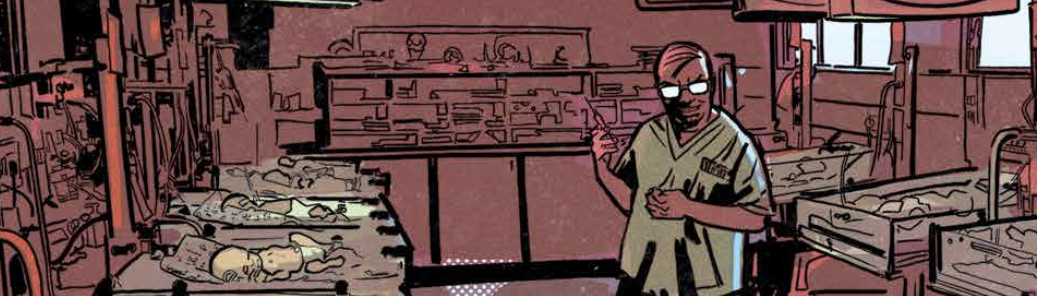
There’s some concern about how complicated things have gotten already. New Hampshire and North Carolina have already been eliminated. Virginia’s asking about her boy. She’s assured that Nurse Pete is on his way to the hospital. He’s about to go to work. And as odd as it might sound, he’s a real contender in the contest. This becomes clear in Exquisite Corpses #3. The writing team of Pornsak Pichetshote and James Tynion IV continue a dystopian murder competition with the aid of artists Valentine de Landro and Michael Walsh. It’s straight-ahead slasher murder horror with a conspiratorial twist that continues to find narrative momentum as it progresses.

Charles Cullen was one of the most prolific serial killers in the history of the U.S. He is confirmed to have murdered at least 29 people, though researchers believe that his total body count could be up as high as 400 total. So it may seem like an obvious choice for early elimination in the contest, but Nurse Pete has real potential as a contender. Of course...he’s got a bit of a small hunting ground. Is he really that much of a force when he’s cornered? Time will tell as the contest continues.
Pichetshote and Tynion are working on several different levels of a script that has to manage quite a lot of different things all at once. It’s pretty remarkable that it’s all modulated as well as it is. Though it’s totally believable that the rich and powerful would gather together a group of serial killers for a competition, the writing team DOES need to do some work every issue selling it as being completely plausible. The writers nail that much more or less perfectly in an issue that also manages a bracingly enjoyable action sequence. The plot is advanced. The background is established more firmly. Everything progresses.
The art team fuses the story to the page with a shadowy visual curtain. Heavy inks overwhelm a page that also finds home to some pretty strikingly garish colors. It’s a stylish approach to something that might work a bit better with art grounded a bit more in the kind of realism that would amplify the creepiness of the premise. To be fair, the artwork itself isn’t at all unrealistic. The moodiness of the issue is cranked-up all the way. If colors and inking were any more intense, they would begin to obscure the actual story.
It’s always difficult to maintain a decent balance in comic book series that are driven by elimination competitions. (It’s not a HUGE subgenre of action/suspense comics, but it’s been attempted enough time to comment on.) A clearer progression from one competition to the next might improve the appeal of the series. If nothing else, a simple preview of the next issue’s competition might serve to amplify anticipation for what awaits between the covers next month. The bracket-style progression of the story would lend itself much better to a more explicit competition format that would include little commentary and analysis packages that would increase the tension.