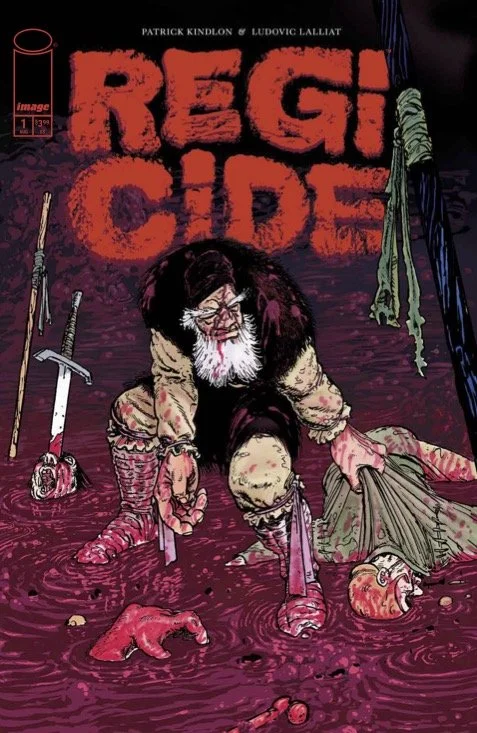
Regicide #1 // Review
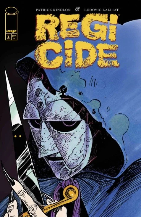
Romania. Tara Rumâneascâ. A long time ago. It’s a gloom y morning in late summer. Laborers are reaping the wheat as the insects manage their own kind of harvest. The whole thing is its own kind of hell as the laborers are worked to death to provide for others. A cloaked stranger comes to a farming village so small that it has no name. The cloaked stranger wears a metal mask. He’s about to propose the unthinkable in Regicide #1. Writer Patrick Kindlon and artist Ludovic Lalliat open an interesting dark fantasy story that has themes which echo across time.
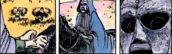
Mihas is being consulted. He’s being asked by the elders of the community to go on a mission for them. He has served the community as well as anyone else. He has helped his neighbors and given his strength for the wellbeing of all. Now they’re asking him to do something else entirely. It’s a mission that requires muscle. It’s not until he is travelling with the stranger in the iron mask that he learns what the mission entails. Rumâneascâ has been poisoned from within. There’s a parasite that must be dealt with...a parasite that sits on the throne.
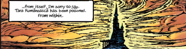
Kindlon outlines are pretty simple story with some very stark poetry. The opening act for a fantasy political thriller carries a great deal of weight. Nature of the story feels very poetically primal. A strong man a small village must go to the capital to assassinate a great darkness. He's a simple man who has guided by a mysterious figure. It's all very striking in the way it's framed. It doesn't need to be set in any specific time, however, placing it in ancient Romania is a nice stylistic touch that gives the artist a little bit to work with with respect to the overall visual design of the story.
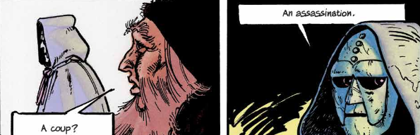
Lalliat does good work with the ancient squalor of a dying farming village. There's a scratchings to the art that serves the setting quite well. However, the dark mystery of the figure seems to require a certain kind of elegance about it. That doesn't really make it to the page. The artist renders everything in the same sort of a desperate, vacant scratchiness. That includes a scene towards the end which features nobility and a whole and equal measure. And though the setting feels perfect perfectly well rendered, it's rendered in his style. It doesn't seem that different from the farming community. There is a lack of decadence an elegance in the execution of line and form that fails to shift things tonally from the beginning of the book all that well.
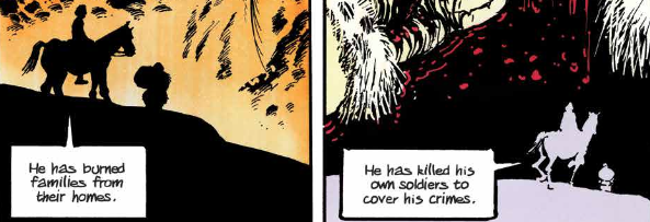
The story seems to be settling into the art as the art is settling into the story. It feel perfectly well balanced in its own way. It would be more impressive if there was more of a dynamic range in tonality, though. It's not like the art isn't striking in its own way. It's not like it isn't appealing in its own way. It just fails to capture the potential of the script completely as of the first issue.