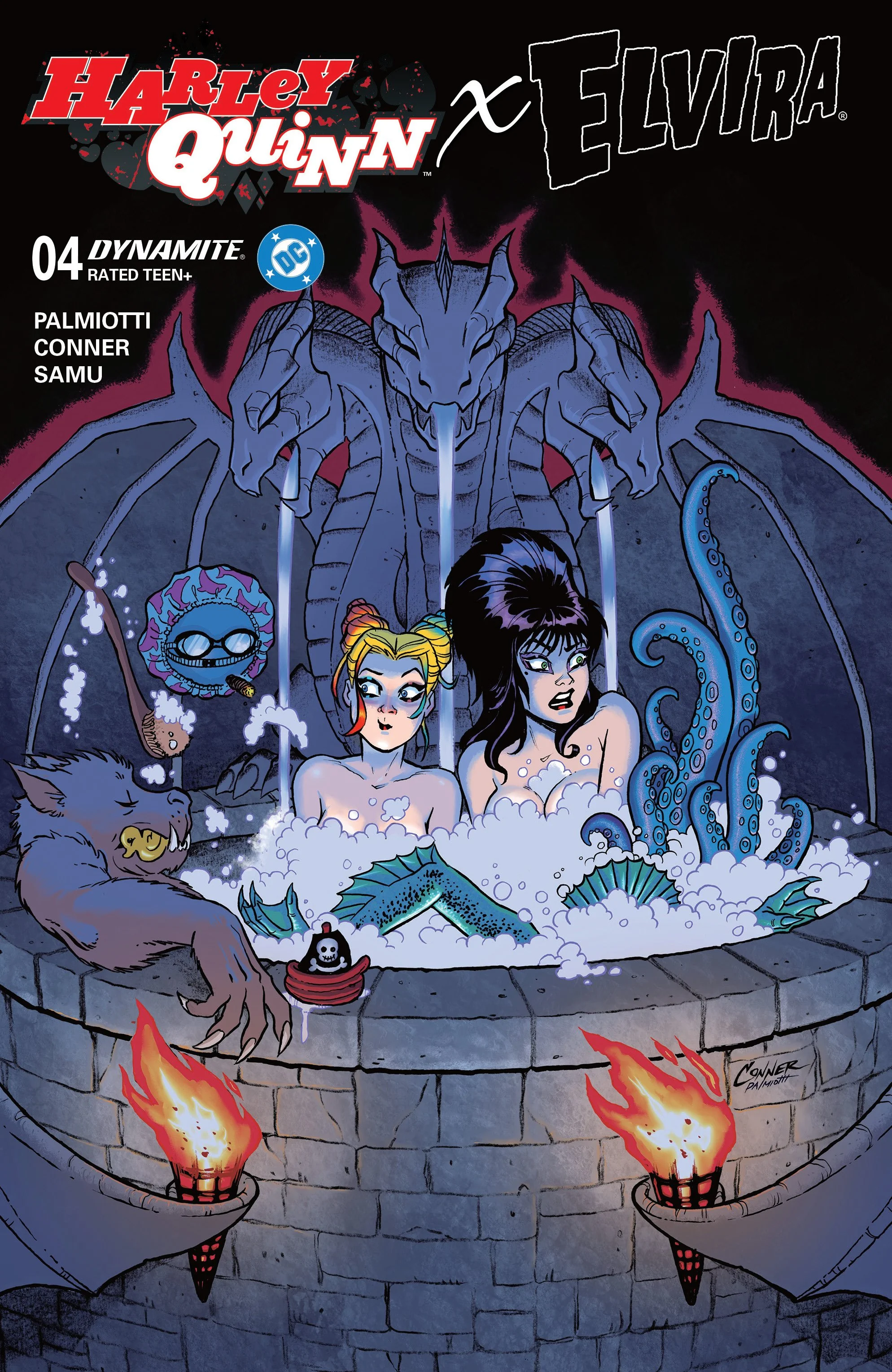
Harley Quinn X Elvira #1 // Review
Harley had a dream. And now she's trying to figure it out. It was as surreal as one might expect from someone like her. Of course, her interpretation of it is going to be even more surreal. And so naturally when she sees an advertisement for a appearance by one of her favorite celebrities, she is naturally going to want to try to resolve her issues by hosting a party. Things are about to go better than one might expect in Harley Quinn X Elvira #1. The writing team of Jimmy Palmiotti and Amanda Conner open a whole new DC/Dynamite crossover series. The story comes to the page by way of the art team of Conner, Juan Samu and Walter Pereyra.
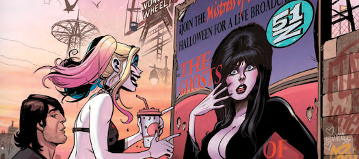
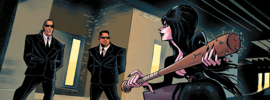
Things haven't been going well for Elvira. She has just lost her hosting gig on television. The producer had a fired, not only her but everyone who was working on the show. She is looking for a revenge, but she's way over powered by the security guards at her producer’s estate. As luck would have it, Harley is looking to have her host a party and it needs to get on her good side. She's also a huge fan of the mistress of the dark and so she would naturally want to help her out. That help comes in the form of a shoulder-mounted rocket launcher.
Conner and Palmiotti amp-up the intensity of a silliness in both Quinn and Elvira. It's a robbery, cartoon sort of a crossover that comes from a strange parallel universe, not entirely out of range of the regular DC universe. It's a lot of fun watching the basic premise of the series developed. However, it would end up feeling kind of lost in its own cartoony intensity if it doesn’t slow-down a bit next issue.
Given the number of people who are involved in the art, the first issue feels like it could have more of a disjointed feeling. All of the styles feel very well paired with each other. And though it's pretty obvious when one artist takes over for another, it still feels cohesive enough to be enjoyable without any jarring transition between artist. Overall, the strange cartoonish-ness of it is well-rendered on the page visually. The pairing of the two iconic characters feels perfectly at home between two covers. The two characters are very well-integrated with each other visually.

Theoretically, the series could've gone in more of a serious direction with some very clever comedy around the edges of everything. That might've been a little bit more satisfying. As it is, it's a very rubbery and strangely enjoyable trip between two covers with two very iconic characters that seem perfectly paired together. It's kind of too bad that they didn't go for something with a little bit more gravity to it. The characters have enough background that they could theoretically support something with a little bit more depth. It's too bad that they didn't want to embrace that.