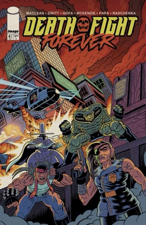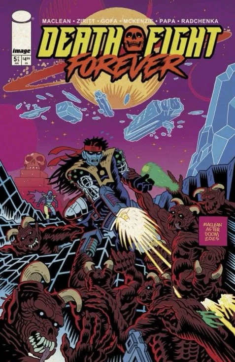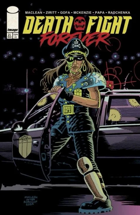
Death Fight Forever #2 // Review
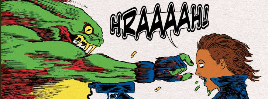
Lord Slyther took her eye. Now she wants revenge. This may be a story isnpired in part by 1980s action tropes, but that doesn’t mean that she’s going to do something stupid like go-in as a lone hero on a dangerous mission or whatever. She’s going to need help. And she’s going to find it in Death Fight Forever #2. Writer Andre MacLean and artst Alexis Ziritt clear-out the end of the first 40% of the series with a weirdly cool action sequence involving a couple of heroes and the menacing snake-headed villain who took Marla Mensoza’s right eye.
Marla looks to a guy named Bash Biggle to help her out with her Slyther problem. She was there when his brother died. He’s not real happy about being reminded of that particular moment. He might even attack her for the audacity to enter his apartment. He’s going to have some difficulty with any kind of attack, though. The guy’s hopelessly drunk. There’s no chance in hell of him actually being able to do anything to Marla. The only question is: what makes her think that he’s going to be of any help at all against Lord Slyther?
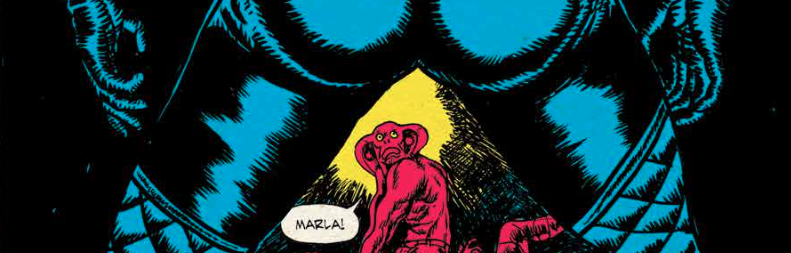
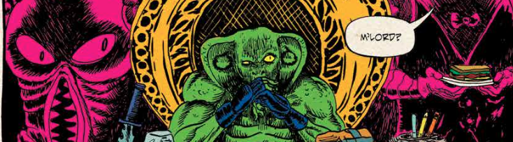
MacLean captures the tropes down almost perfectly. The fantasy science fiction action hero feel of the story continues. It's pretty simplistic stuff. The central theme of revenge in a world of good and evil feels sturdy enough to serve as the central skeleton for a story featuring a lot of action and a little bit of drama. The story is suitably, overblown, and exaggerated the weird surreal quality of the stories serves as the breathing ground for some particularly weird visuals. It all feels remarkably well centered on the page for a 1990s zine-like in the comic book with a hand-made feel.
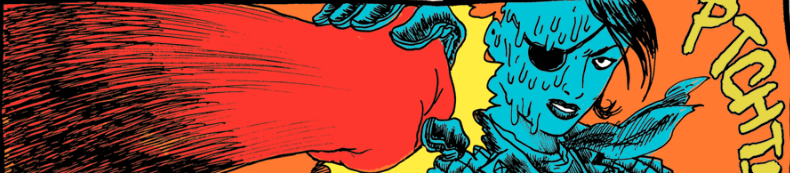
Ziritt’s best work tends to look like a cross between Kirby, Ditko and something one might expect to find in some nameless metalhead’s high school notebook at some point in the early 1980s. It’s an acquired taste, but it has its own appeal that is not entirely out of synch with what MacLean is placing on the page. Here the artist is working with nibs and fountain pens. (He mentions as much in the Q&A at the end of the issue.) As a result, the visuals lack the fluidity of some of his better work. There's a stiffly crude scratchiness about the art that actually feels kind of appealing in its own way.
The real appeal of this series is that it really kind of feels like something a couple of guys in high school would've come up with in 1984. It’s like…hanging out in study hall and a couple of kids with Metallica t-shirts show you this thing that they’re working on and it’s actually remarkably well-though out…for a couple of kids in high school. There's a deliciously crude to feel about it that comes across as something that really normally would not make it onto the shelf of a comic book shop. And yet there it is: weird, fun and delightfully amateurish. There's a real love that's going on here that isn't it all self-conscious. It's just a writer and an artist having fun on the page. That's actually kind of refreshing.